Context
StayCurrentMD is a medical learning app that helps practitioners at all levels to connect, learn, and share latest medical information. StayCurrentMD creates and aggregates expert, on-the-go medical information through a wide array of interactive media, including video casts, podcasts, articles, discussions, and more.
In the fall of 2022, I participated in a UX/UI Design course at college, where I seized the incredible opportunity to collaborate with GlobalCastMD (GCMD), the company that owns the StayCurrentMD app. This experience provided me with hands-on involvement in a UX design project with a real client.
The problem
StayCurrent aims to enhance its navigation and search capabilities to address the challenges faced by their primary users, clinicians, who find their existing search functionalities to be inconsistent and ineffective.
The goal
StayCurrent aims to enhance its navigation and search capabilities to address the challenges faced by their primary users, clinicians, who find their existing search functionalities to be inconsistent and ineffective.
Result🌟
As part of a college course, this project focused on enhancing GCMD's user satisfaction rates and refining search accuracy. All deliverables were successfully submitted to GCMD by the semester's end, receiving positive feedback. Following that, I was offered an internship opportunity at GlobalCastMD as a UX/UI Design intern for the upcoming semester.
Discovery
Having meetings with the client and some user representatives helped me gain a comprehensive understanding of the problem and the client and user requirements. I posed discovery-related inquiries regarding the client's background and their current product. I used these insights to guide this project's trajectory. The key findings and conclusions from these interactions are summarized below:
"Too browse-based"
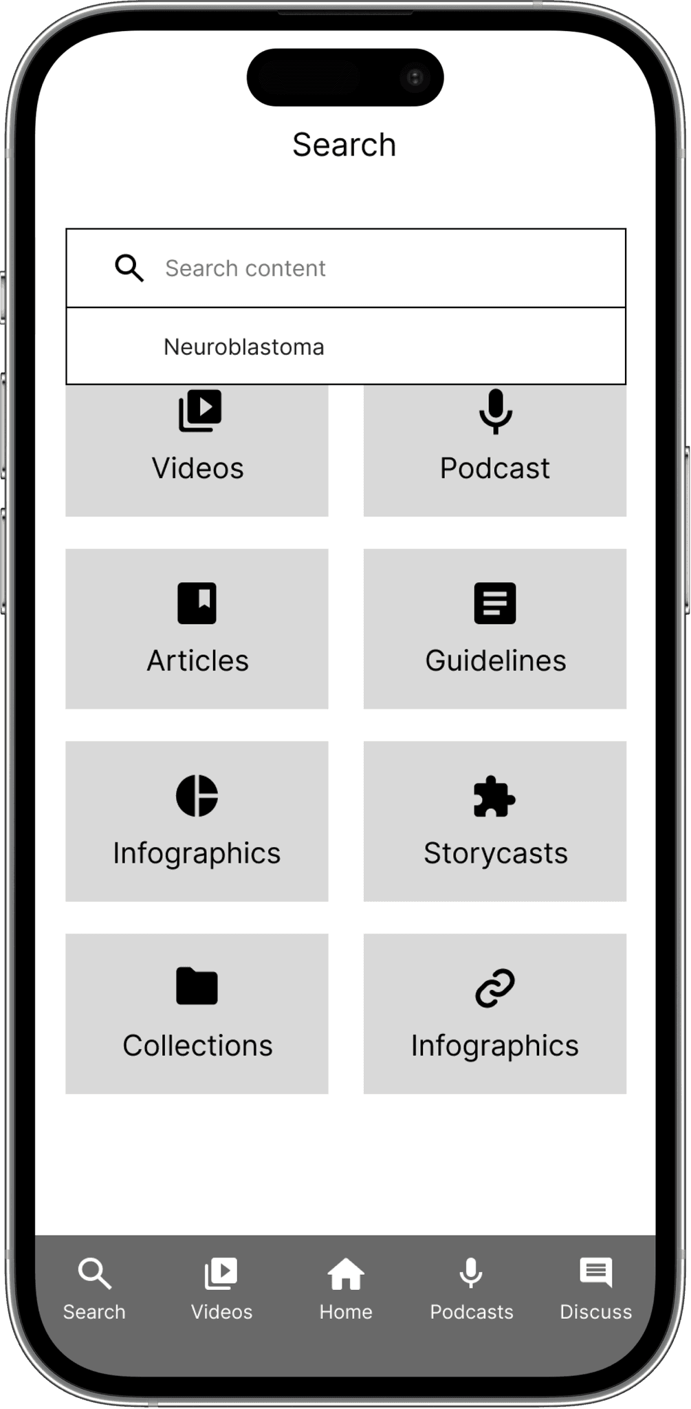
The client explained that the app is currently too browse-based. Most of their users visit the app to find a specific information, so a search-based approach must be prioritized to fulfill their needs.
It's hard to search a specific information"
StayCurrent's search functionality is currently not suitable for their user's behavior. They currently offer a global search function and many category-based search functions, which some users find confusing.
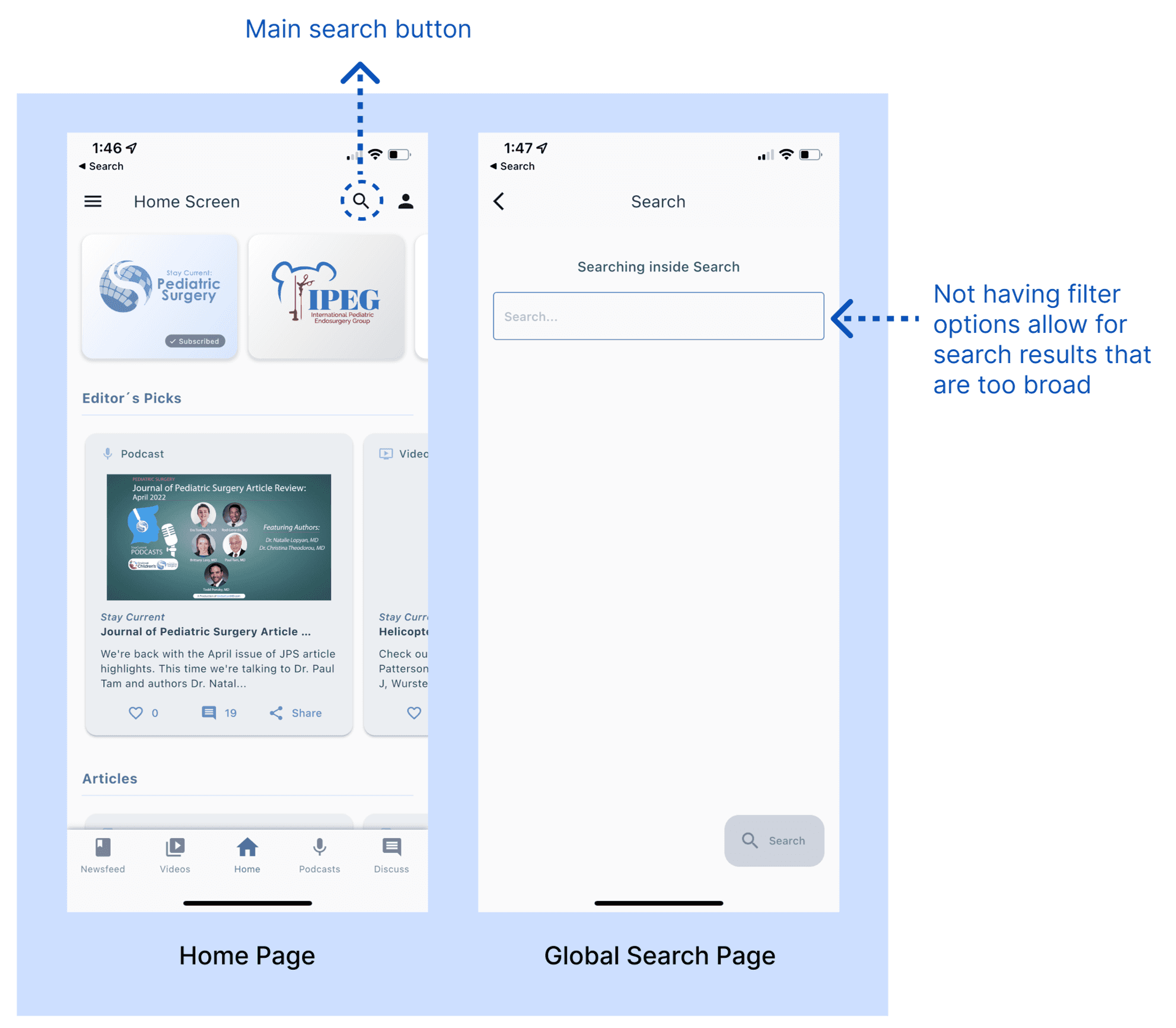
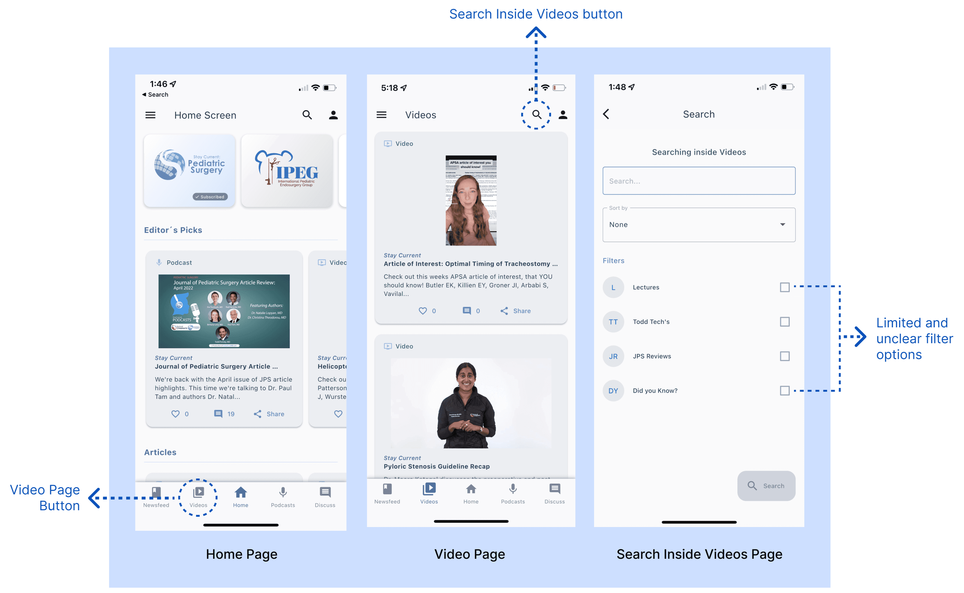
I conducted an evaluation on the existing product to better understand the problems surrounding their search functionality. StayCurrent currently offers one global search in the homepage along with media category-based search functions located inside each media category page (video page, podcast page, etc.). Here are some problems I have identified during the evaluation:
Missing filter in global search 😵💫
The global search function in StayCurrent does not come with any filter options, resulting in ineffective search experience for the users. Also, the global search button is only accessible from the Home Page, which may prevent users from accessing it quickly when they are located in another page in the app.
Inconsistent and unclear filters in category-based search 😬
I included some screenshots of the category-based search functions from videos, podcasts, and articles pages. Some search functions come with filter options and some don't. The filter options are also very limited and some are unclear.
Opportunities to improve the cards
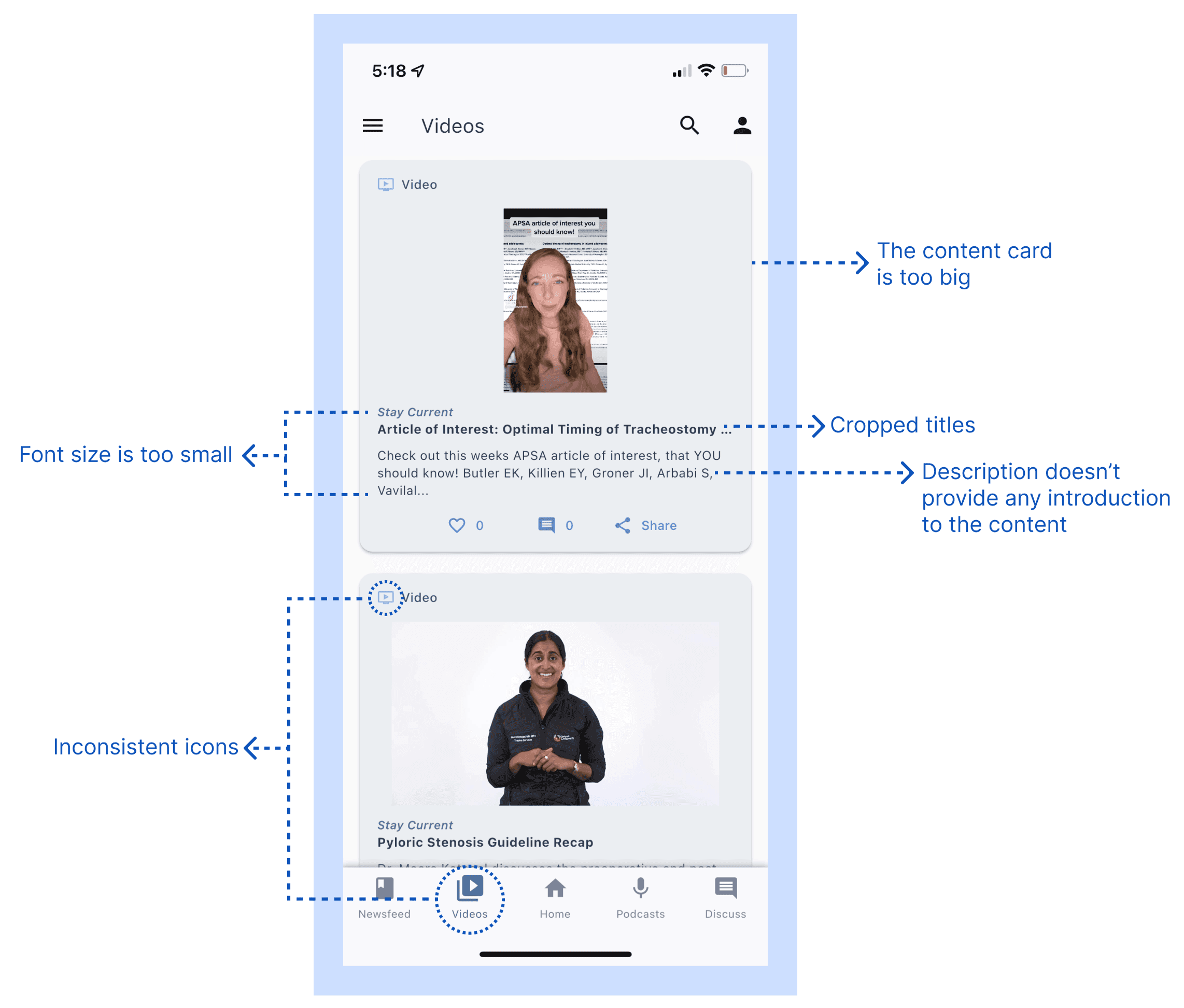
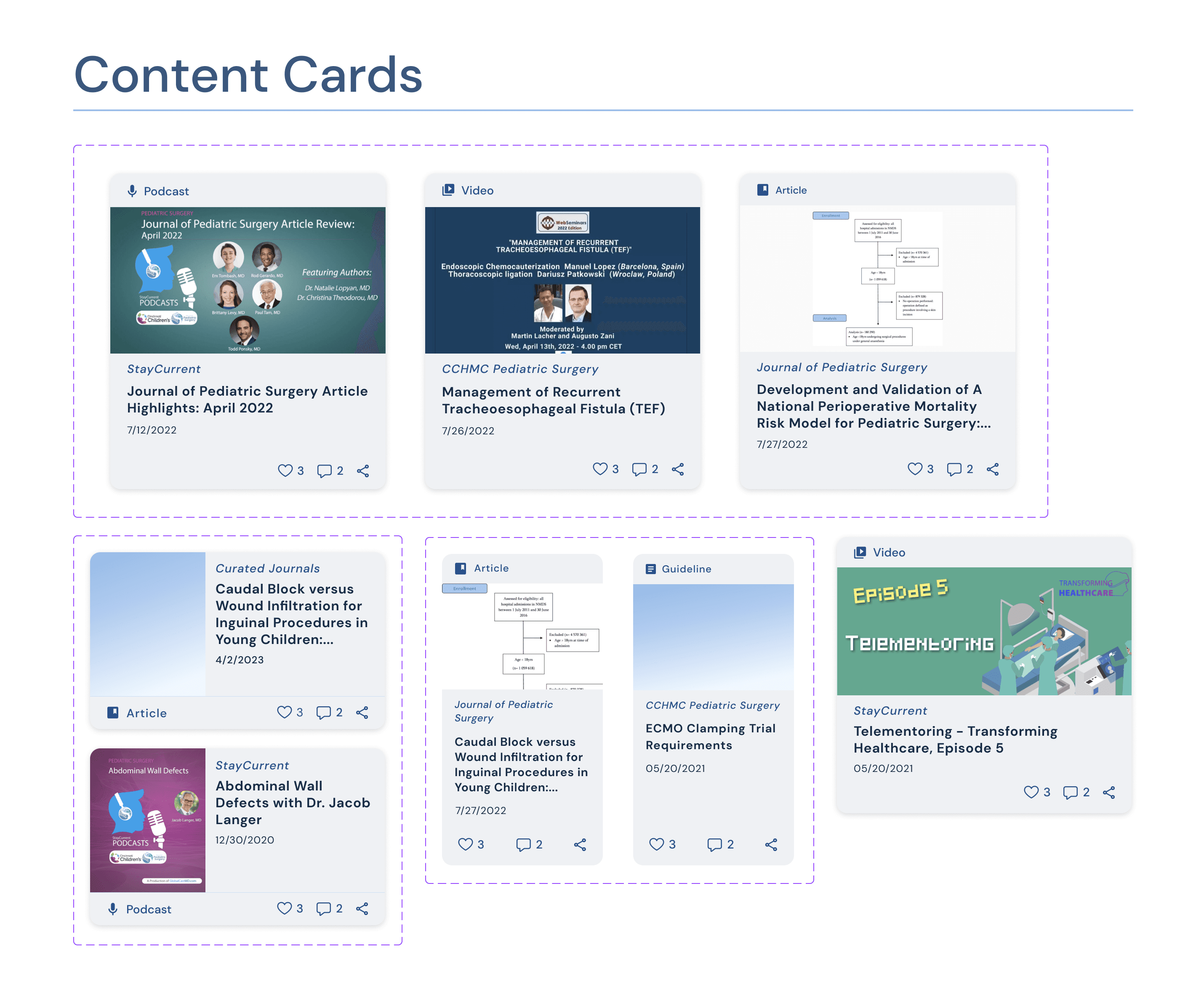
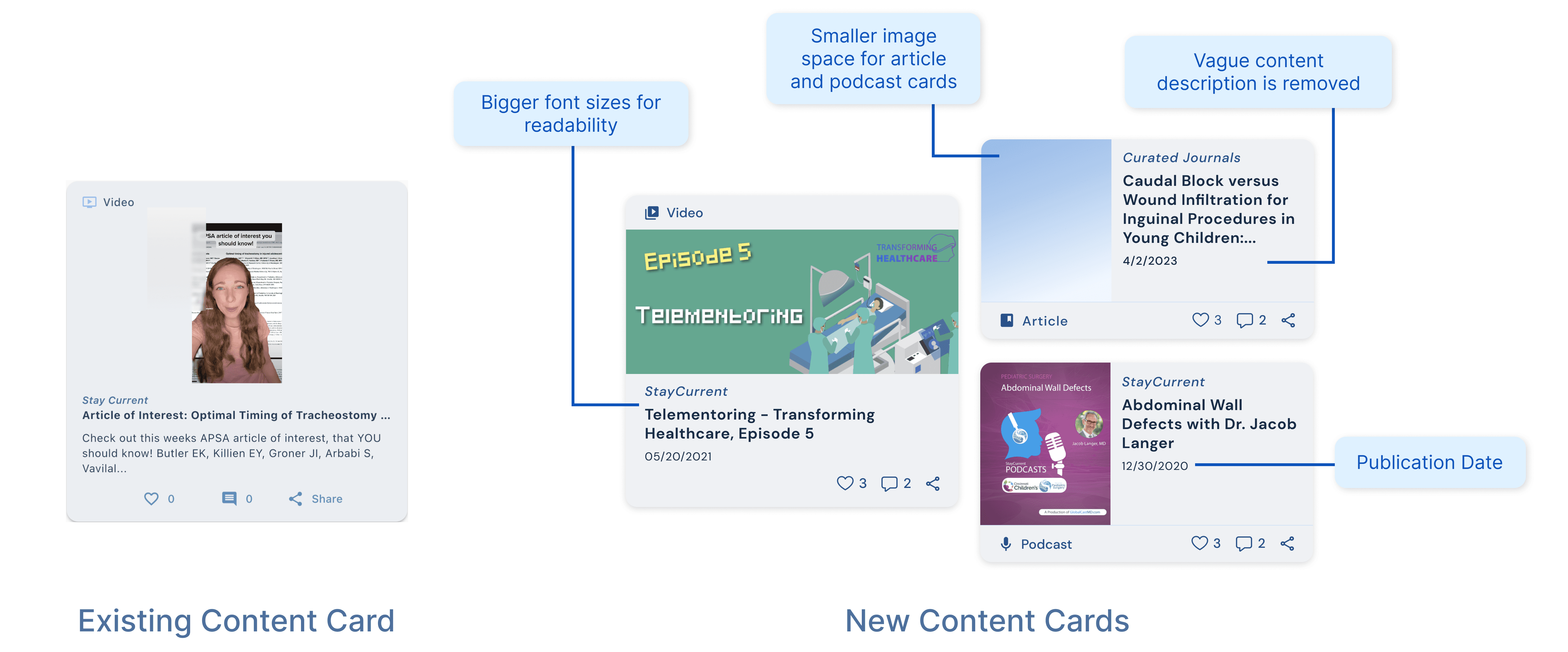
The content card's size is large, but it doesn't effectively fulfill its purpose of providing an overview to users. The cropped titles, vague description, and small font sizes make it difficult for users to understand the information.
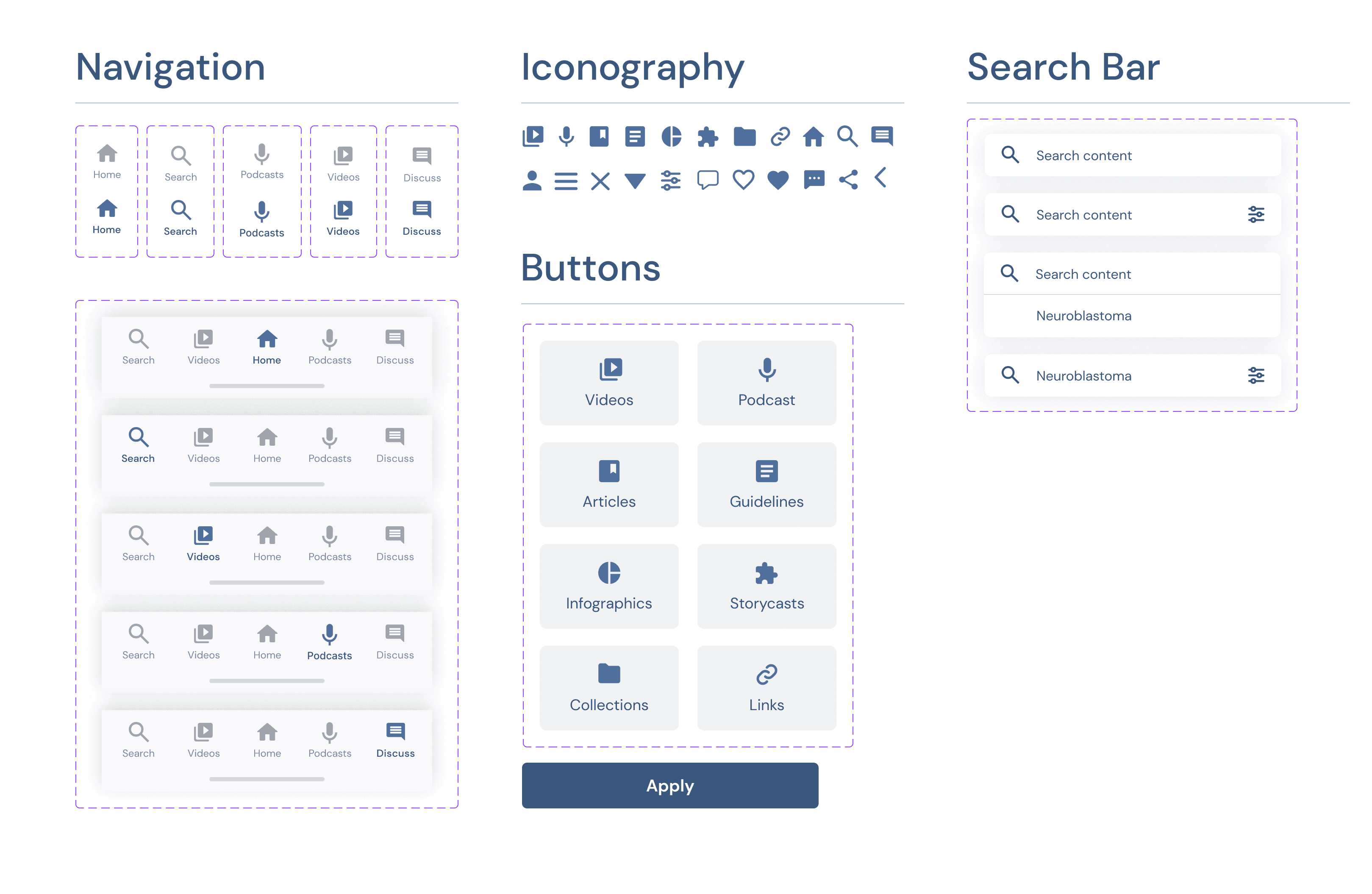
Inconsistencies were also noticed in the app's use of icons, such as the video icon being different in the content card compared to the one used in the bottom navigation bar.
Ideation
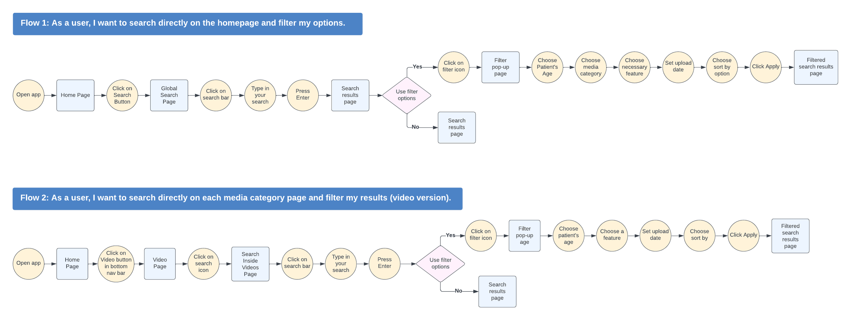
For this project, the client specified 2 user flows to focus on.
As a user, I want to search directly on the homepage and filter my results.
As a user, I want to search directly on each media category page and filter my results.
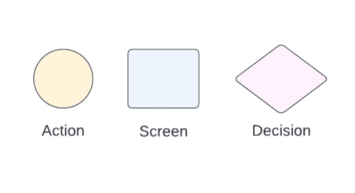
Based on the problems identified previously and the provided user flows, I worked towards addressing these concerns by formulating potential solutions aimed at enhancing the search capabilities of StayCurrent.
Design
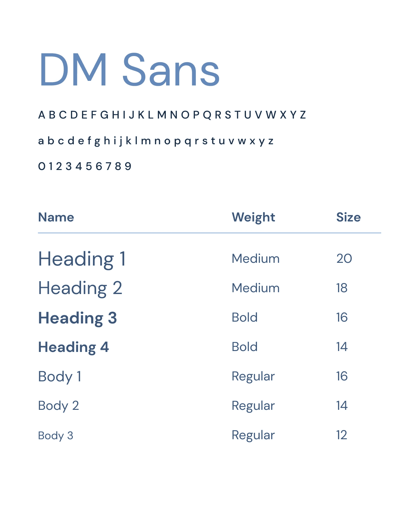
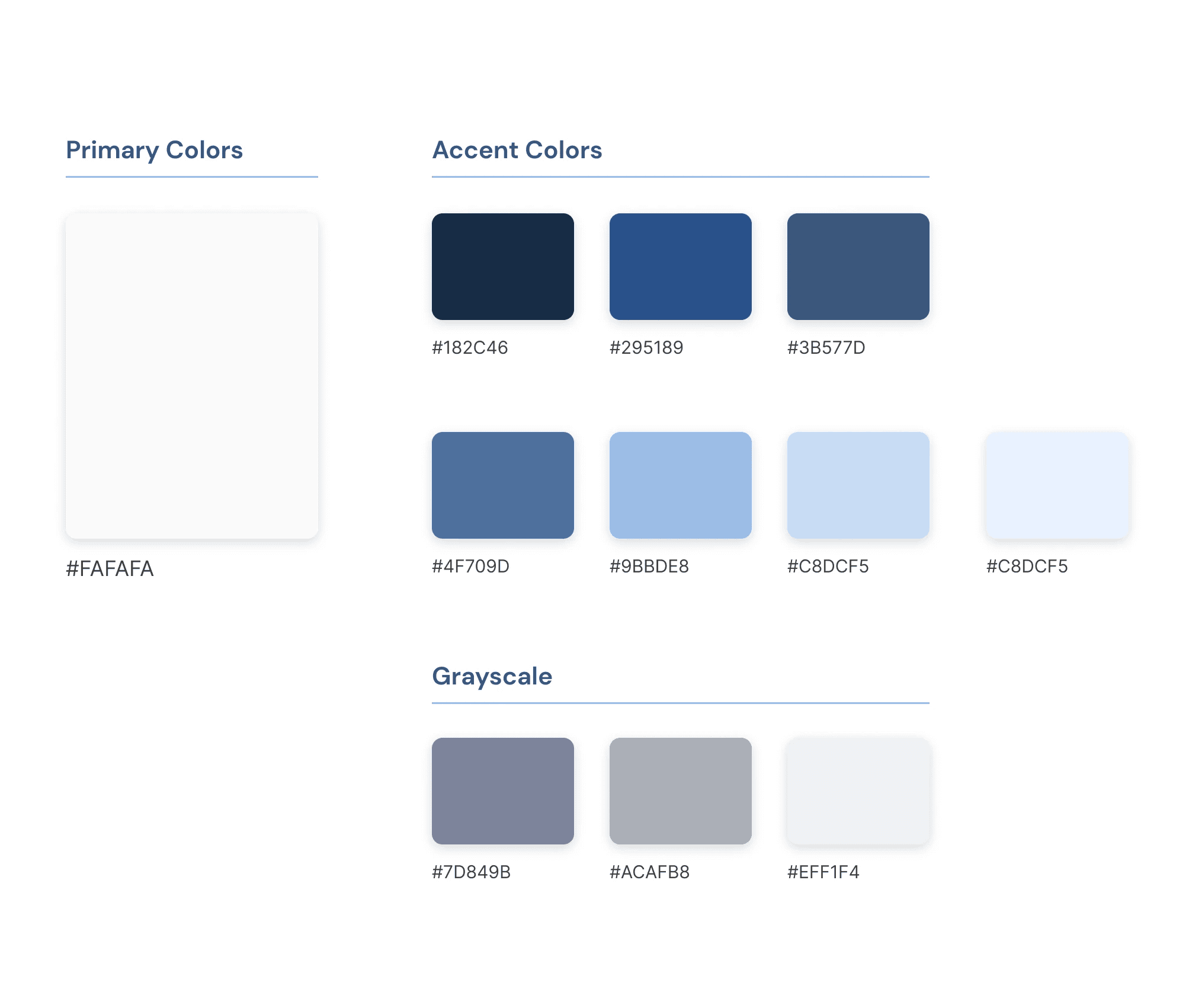
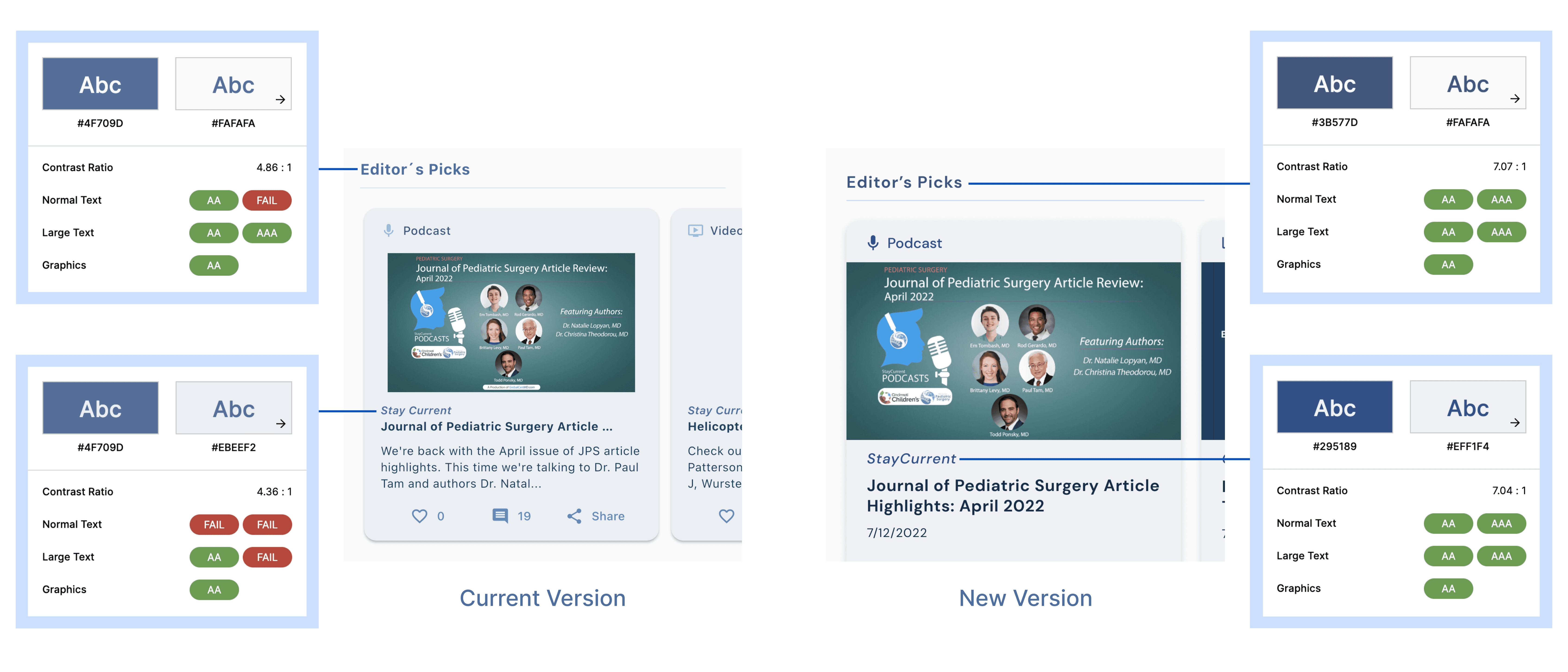
In order to maintain uniformity across all screens, I crafted a comprehensive style guide consisting of various elements, such as color palettes, typography styles, components, and iconography. In terms of colors and typography, I incorporated the client's established style guide with subtle refinements to optimize readability and accessibility.
Accessibility
Certain color options in the StayCurrent app currently do not meet the WCAG standards. In order to enhance the app's accessibility, I have made adjustments by incorporating alternative colors that comply with the standards.
Proposed Solution #1
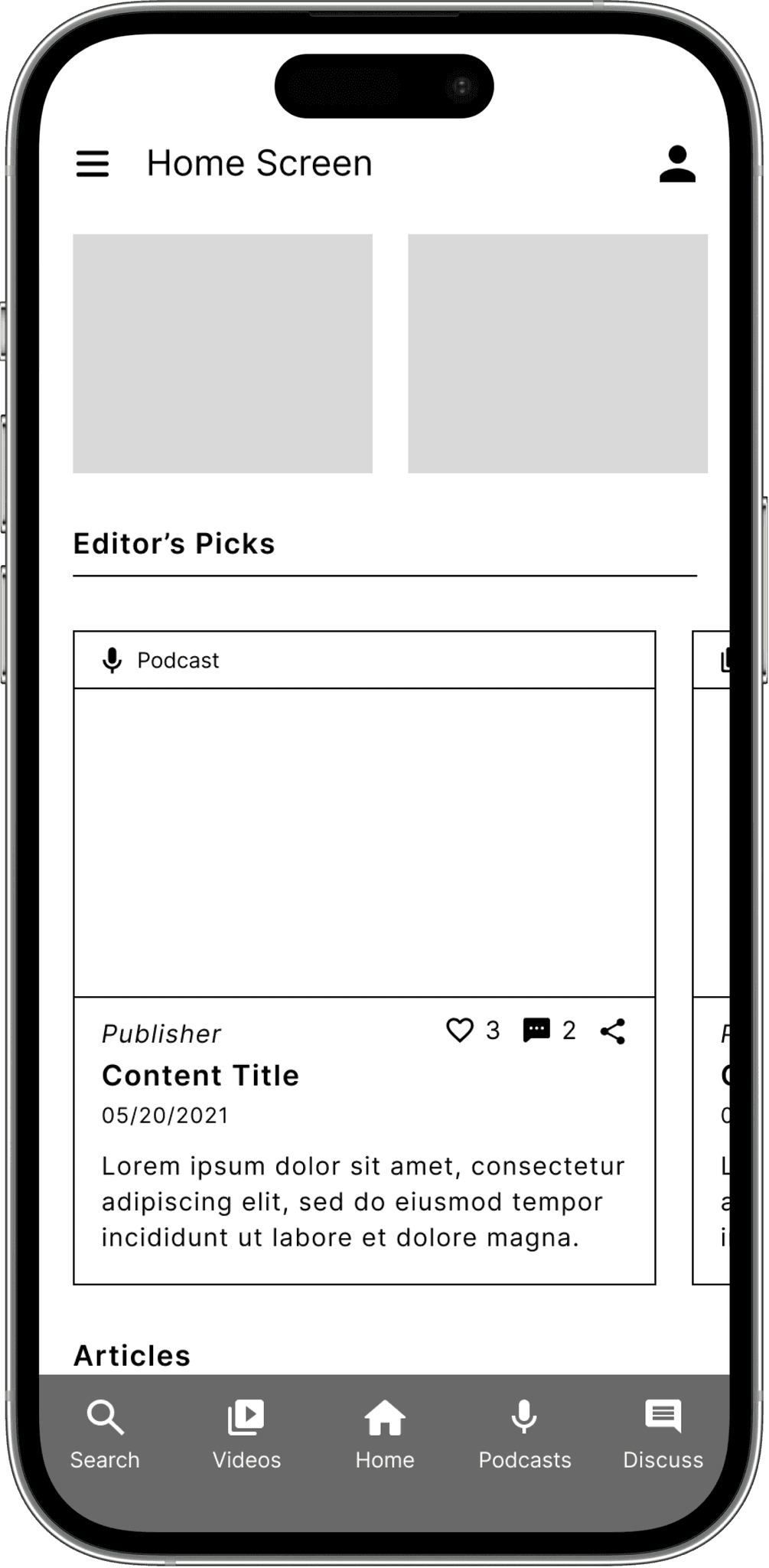
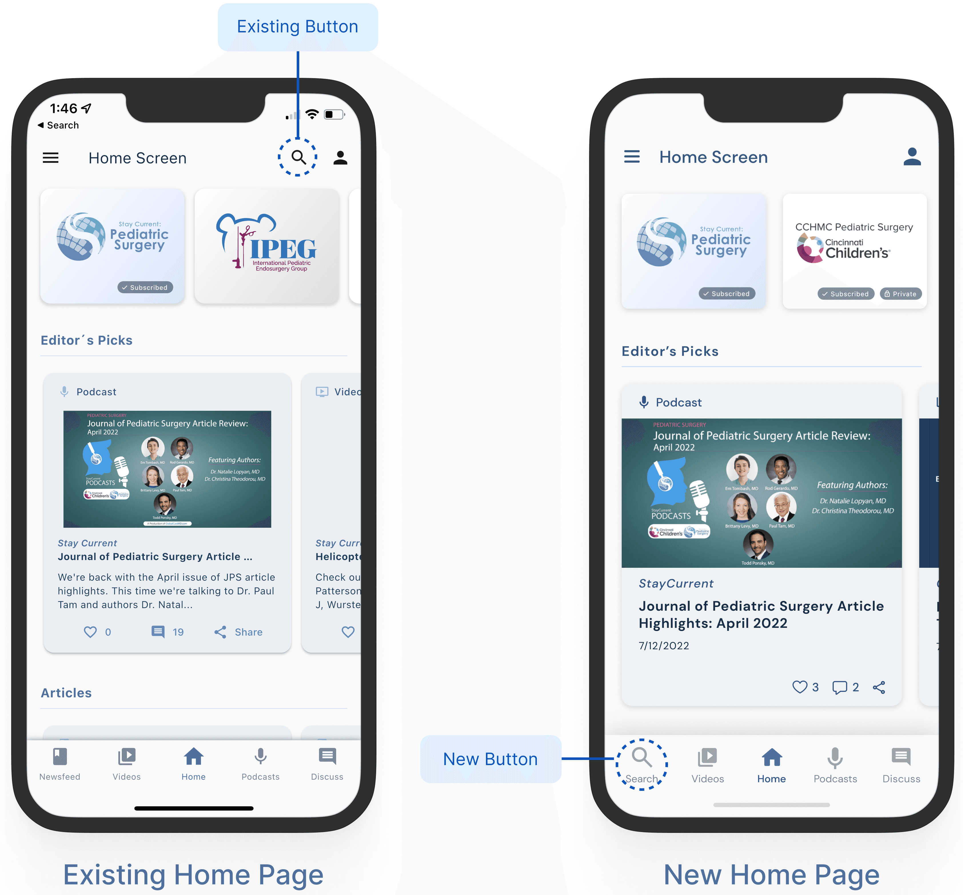
During the existing product evaluation, I noticed that the content displayed on the Newsfeed page is identical to the content featured in the Editor's Picks section on the Home Page. Following discussions with client, we reached an agreement to merge these sections and remove the Newsfeed page.
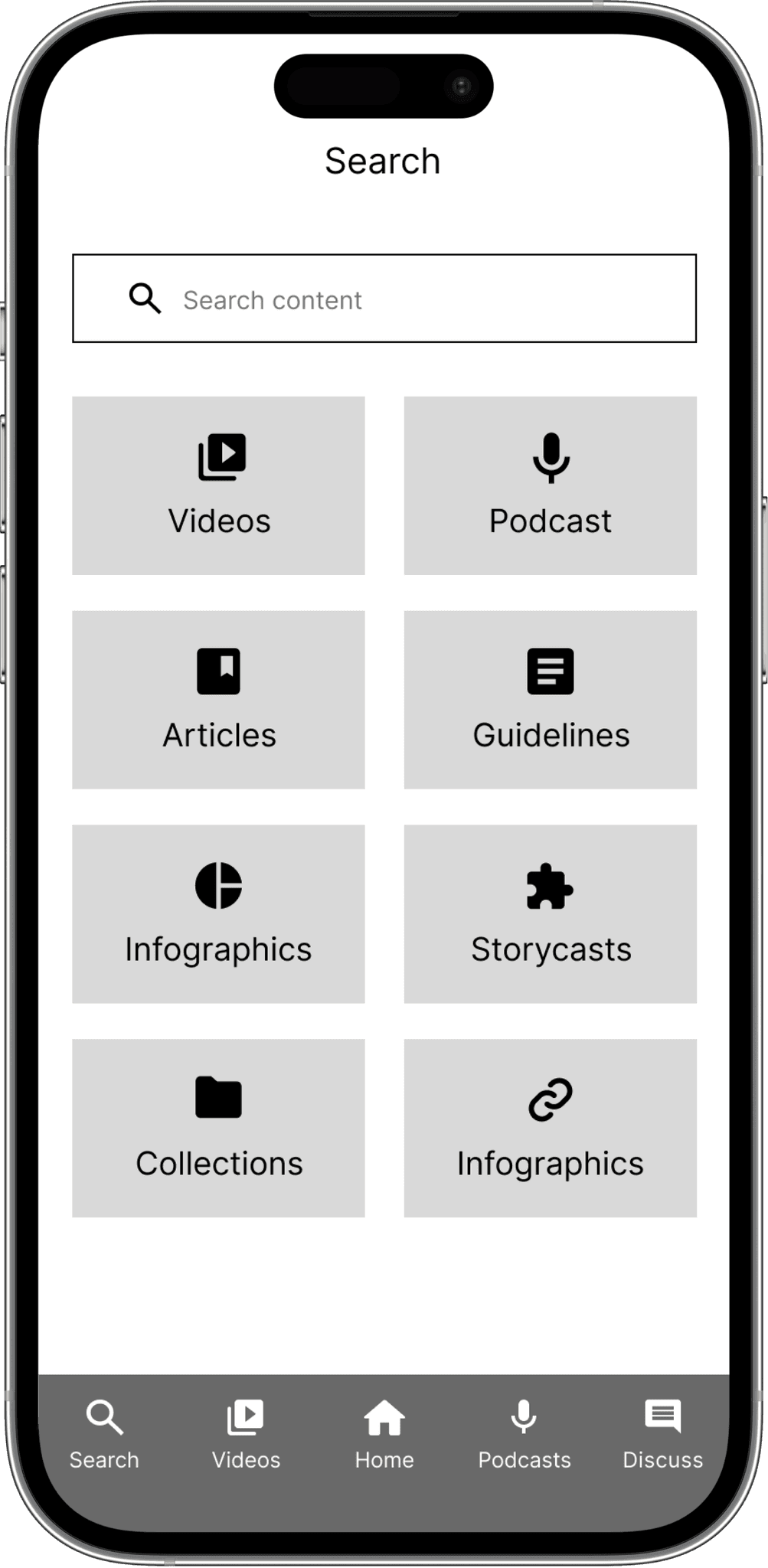
As a result, I replaced the Newsfeed button in the bottom nav bar with the global search button. This change aimed to enhance the user's ability to conveniently access the global search function from any page within the application.
Proposed Solution #2
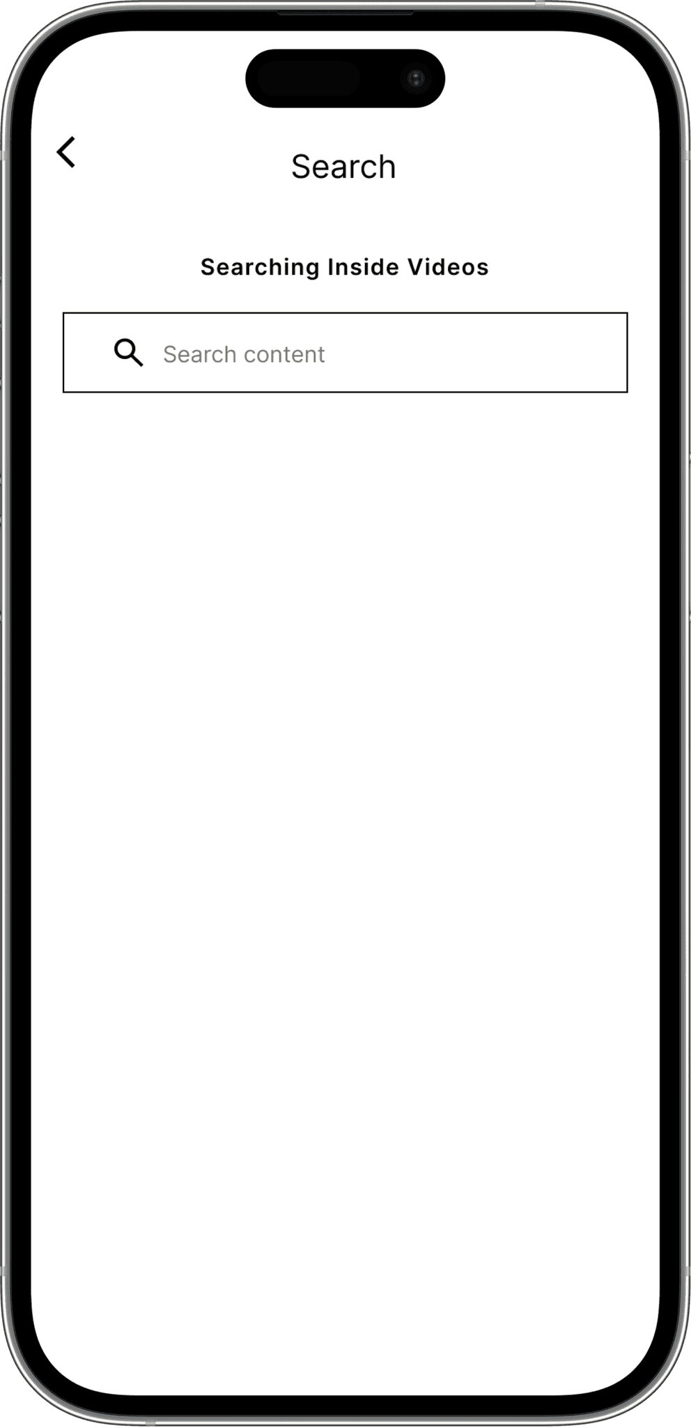
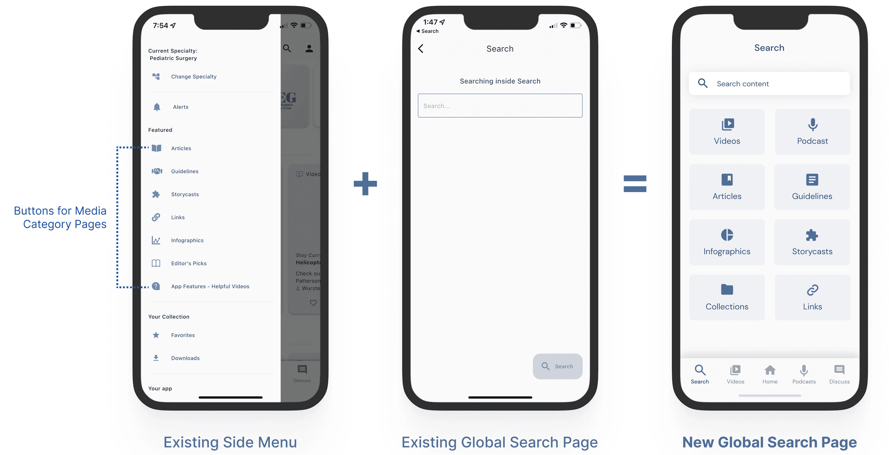
While the video and podcast pages are readily accessible through the bottom navigation bar, the other media category pages can only be accessed through the side menu. In order to enhance convenience when accessing these pages, I consolidated the corresponding buttons into the global search page.
Proposed Solution #3
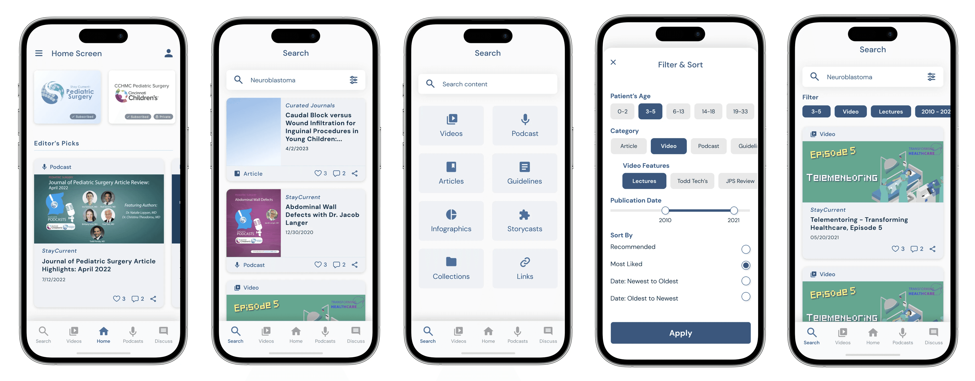
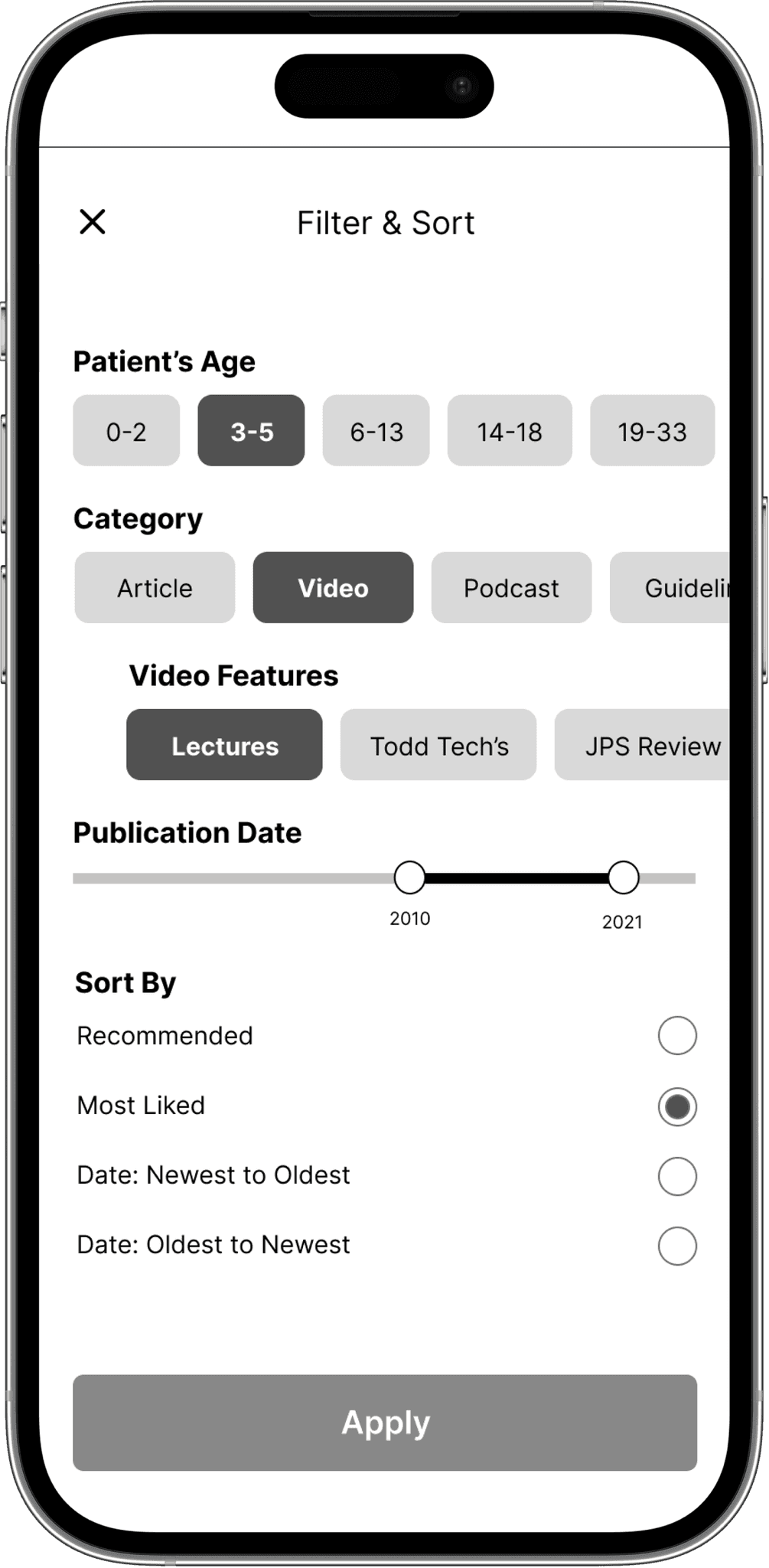
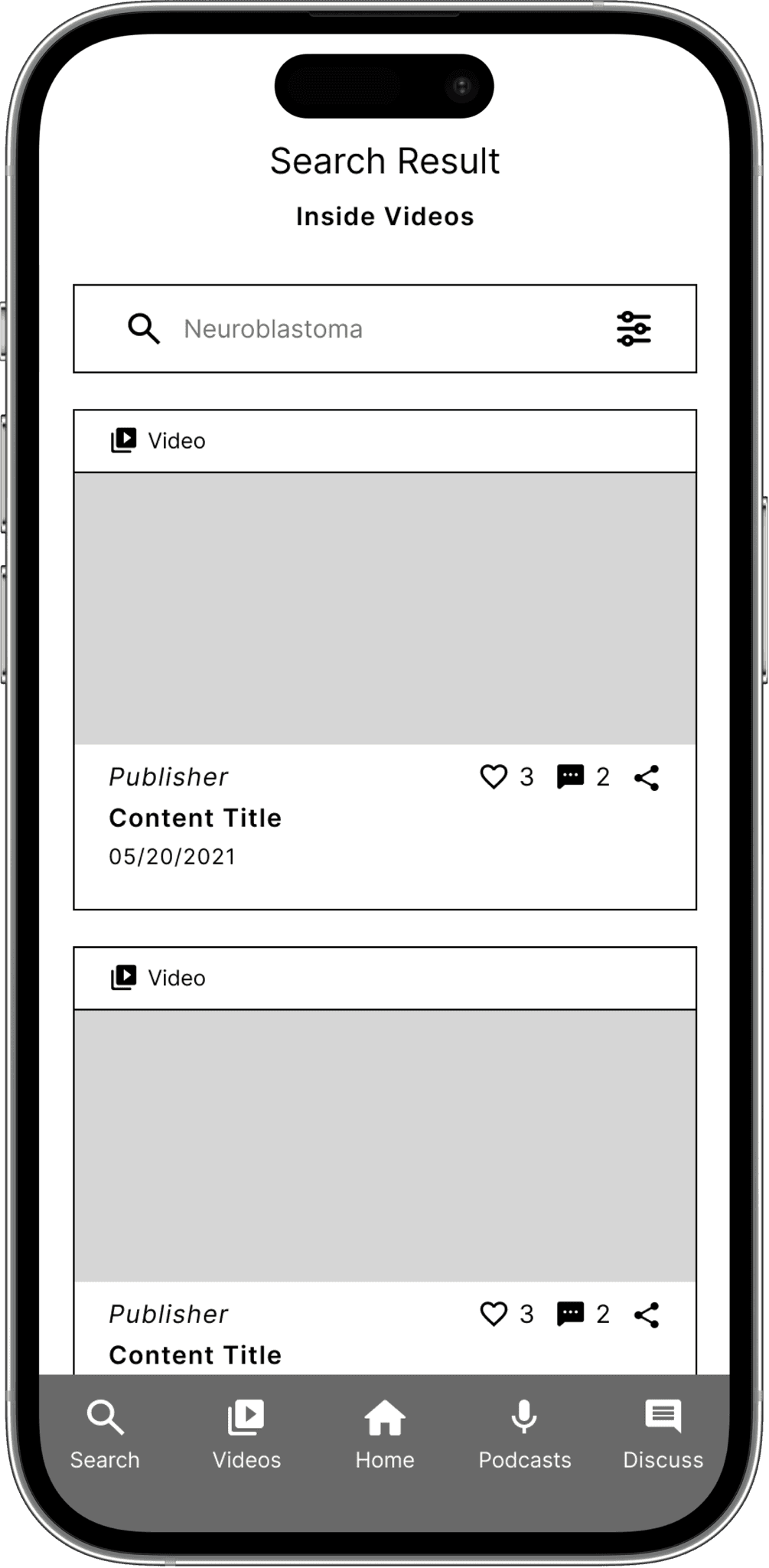
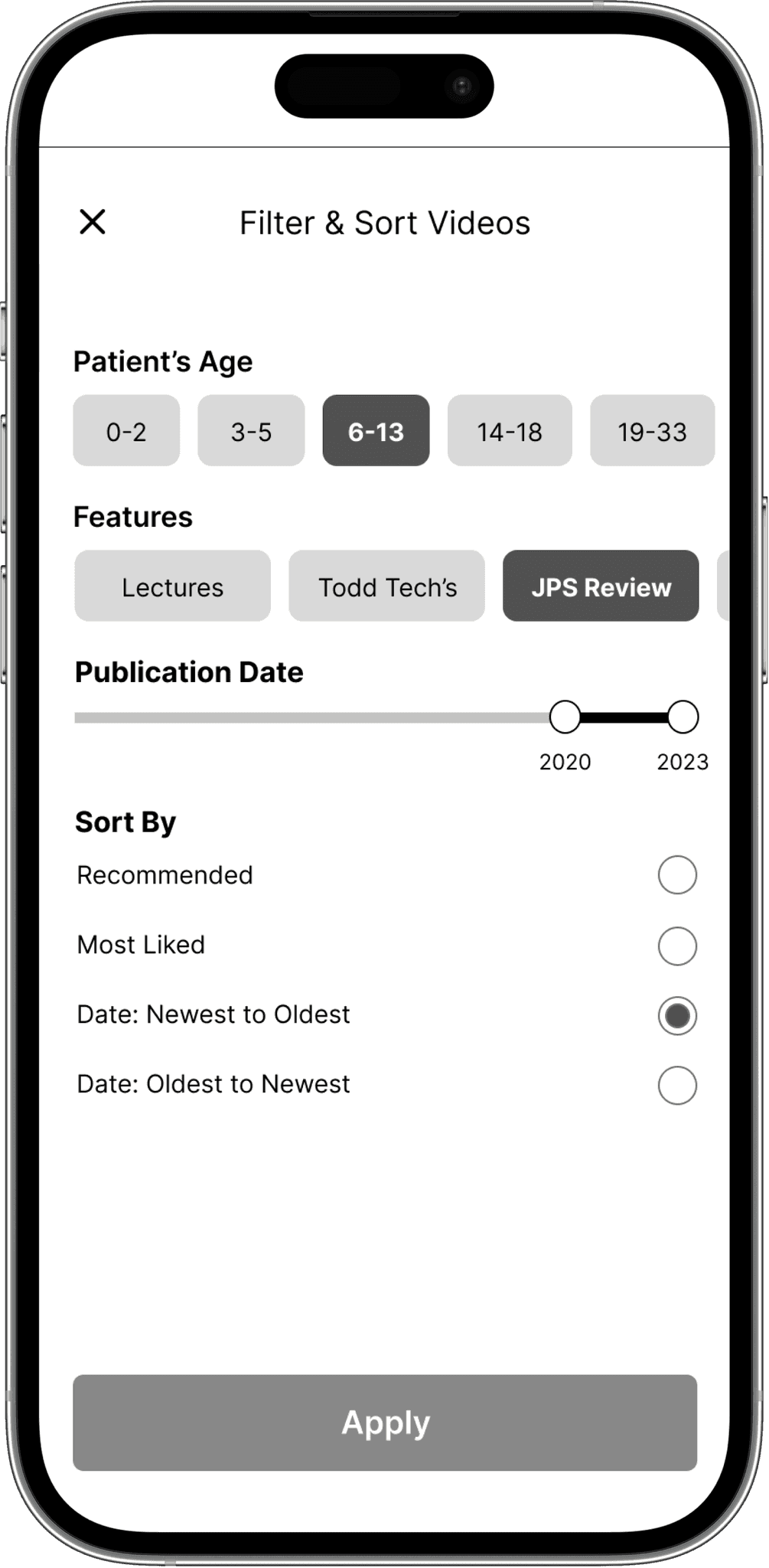
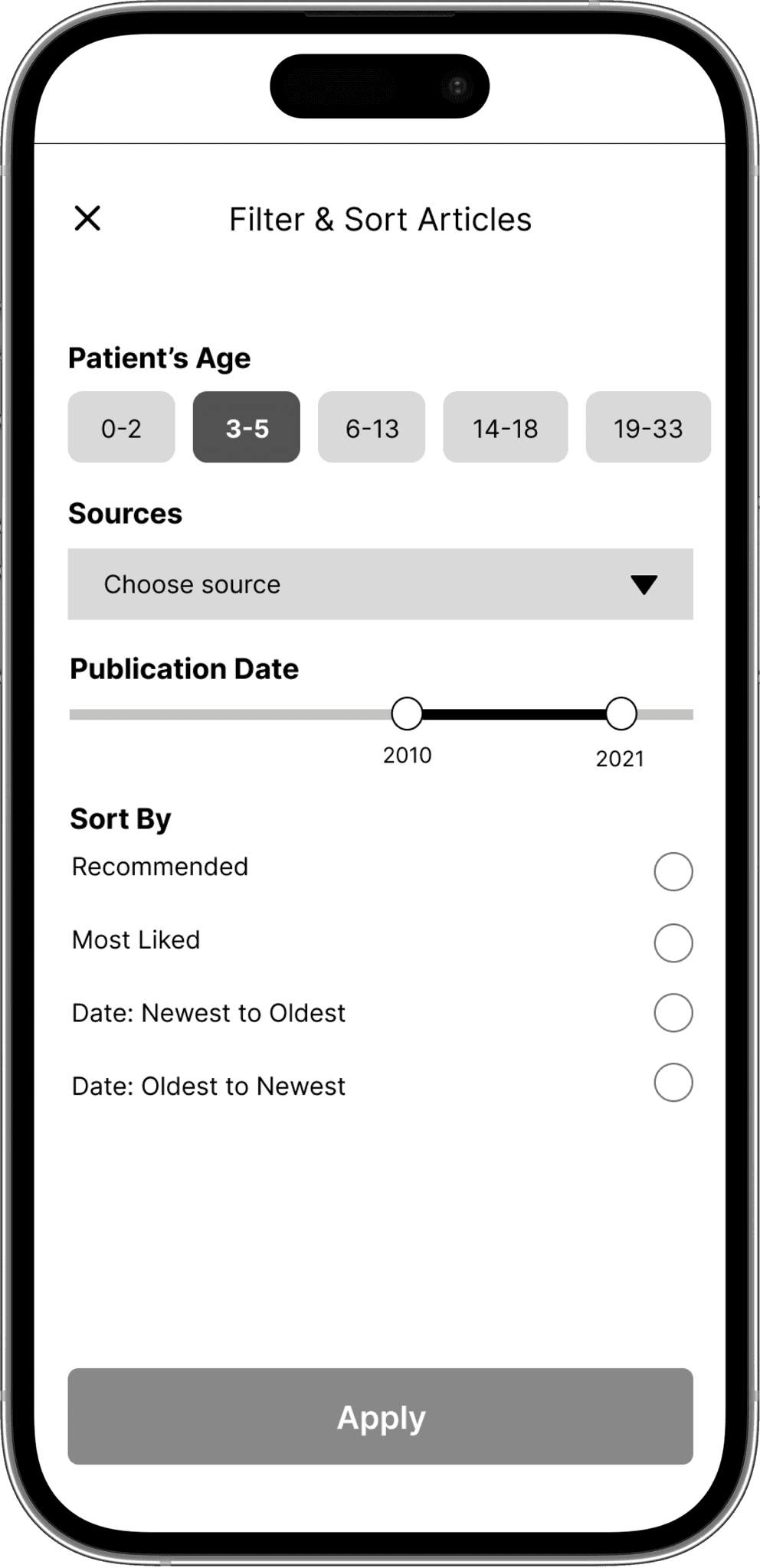
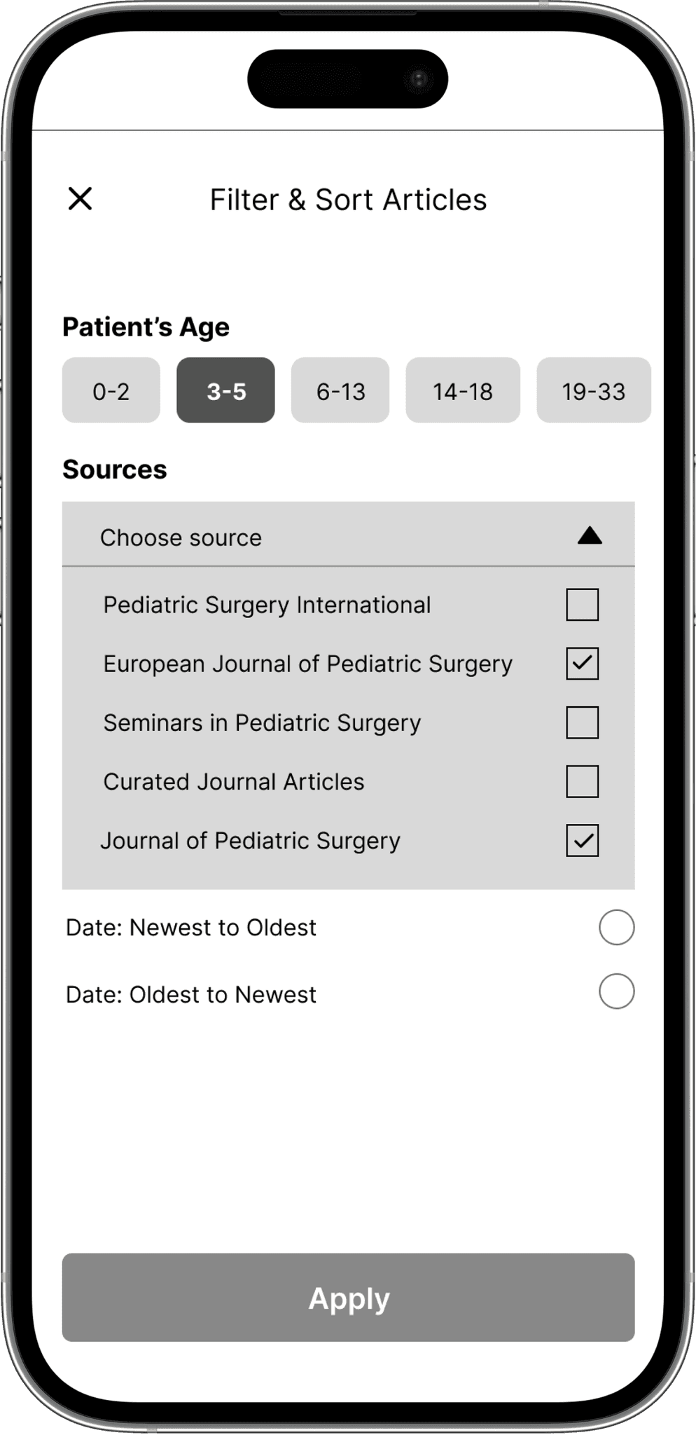
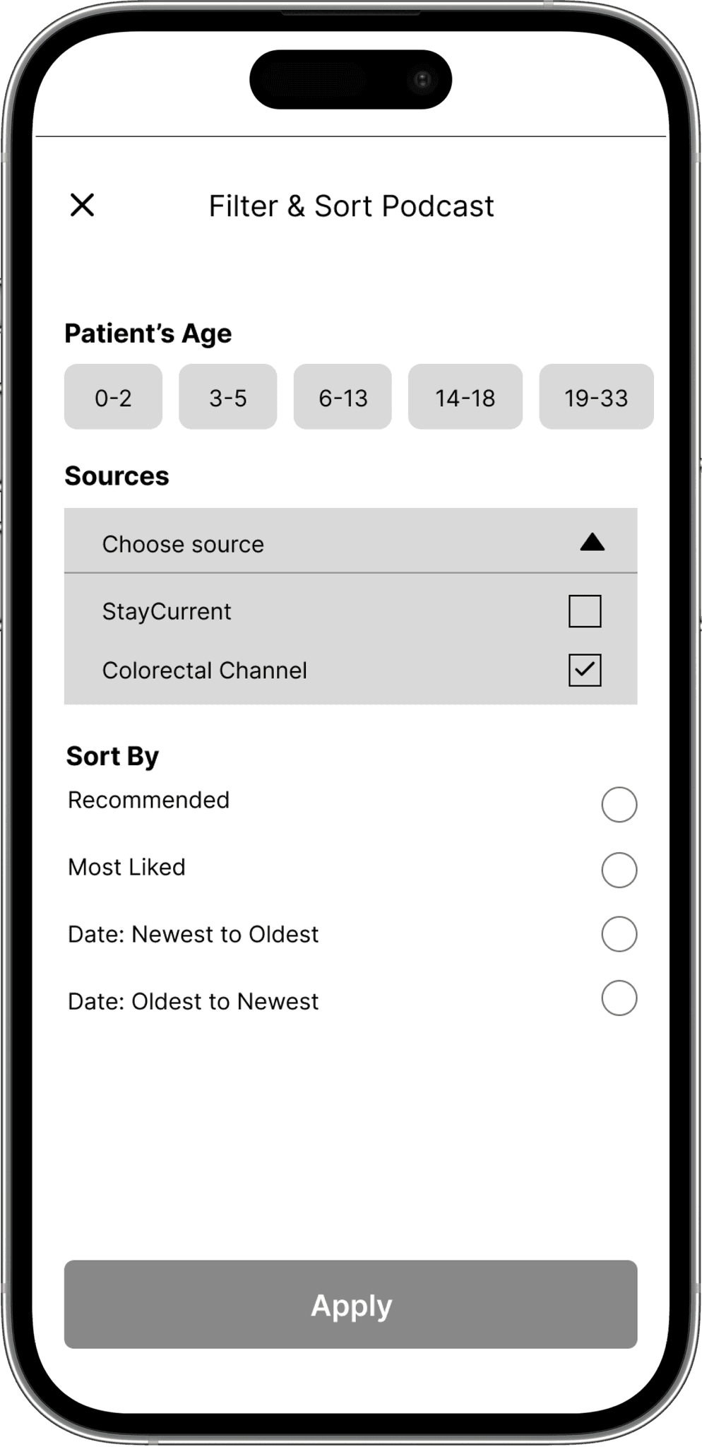
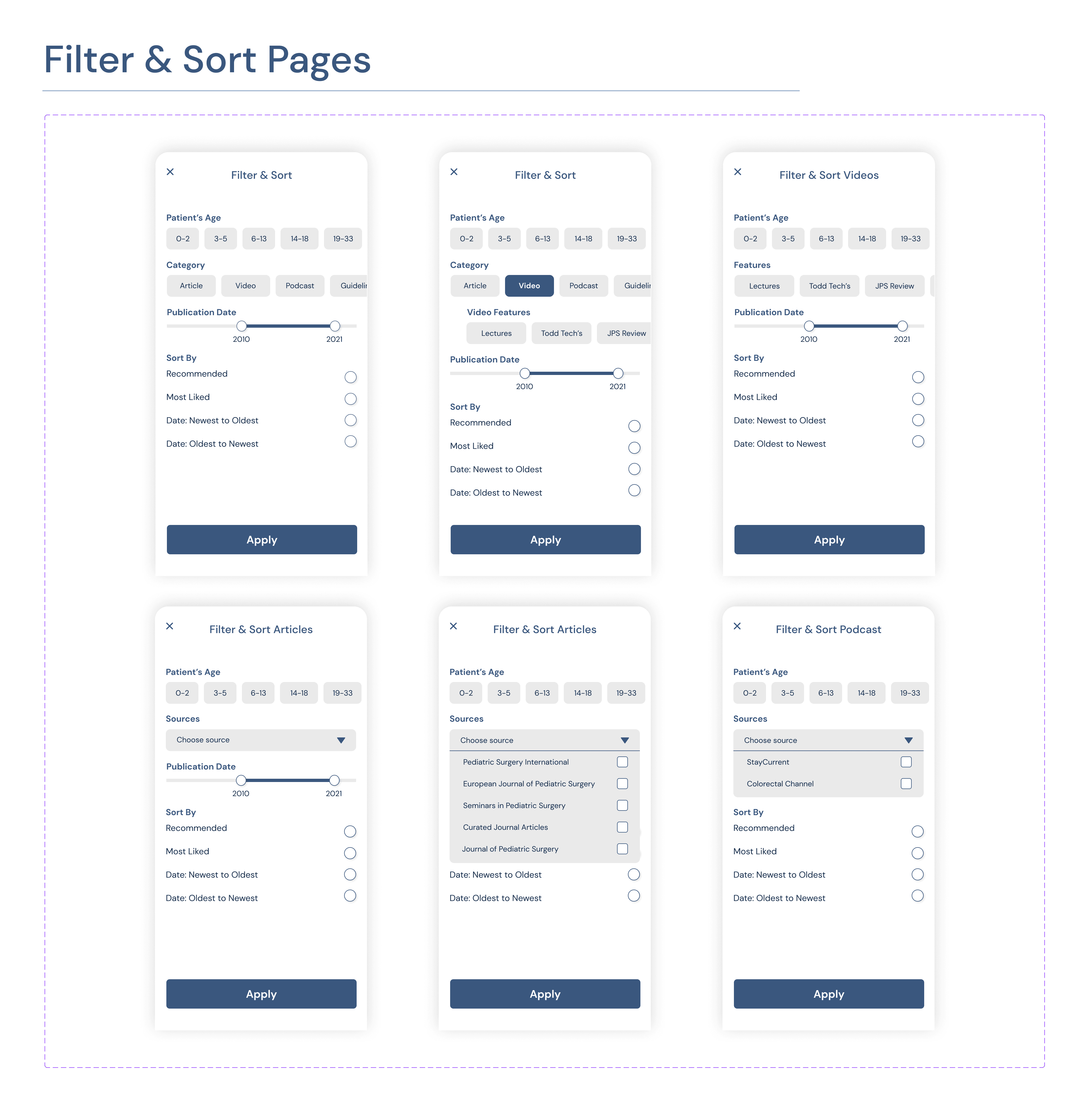
Filter options are added to the global search function to enhance user convenience and efficiency. The filtering process was designed with learnability in mind. My intention was to enable users to effortlessly utilize the filter options from their very first attempt.
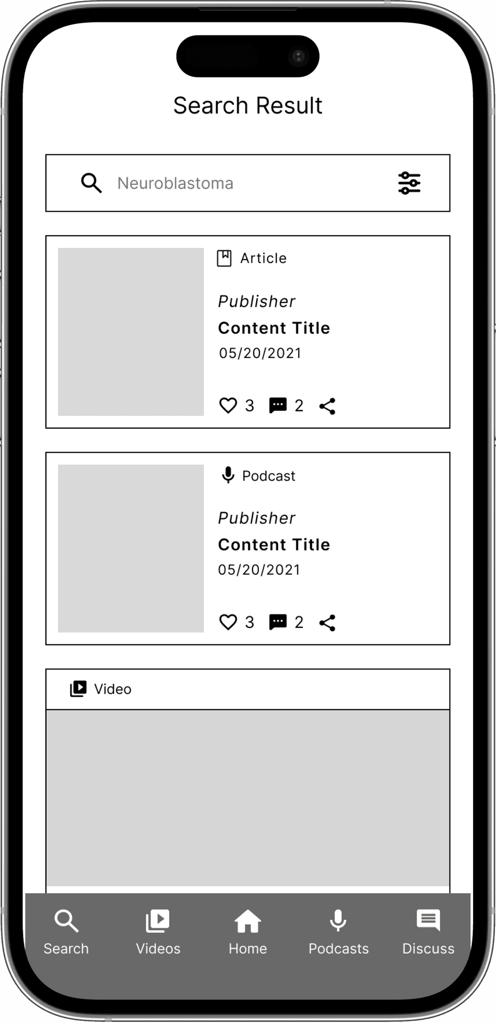
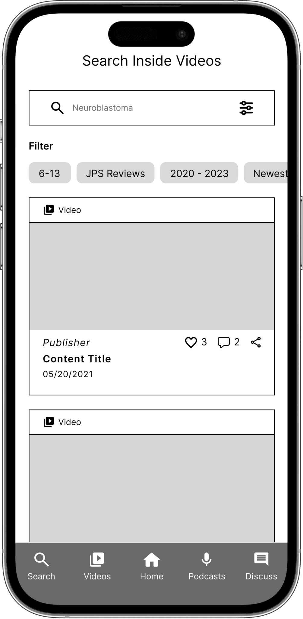
Additional filters tailored to specific media categories are also added to provide a more personalized search experience. Furthermore, the search query and selected filters are displayed at the top of the page, allowing users to easily reference their recent search.


Proposed Solution #4
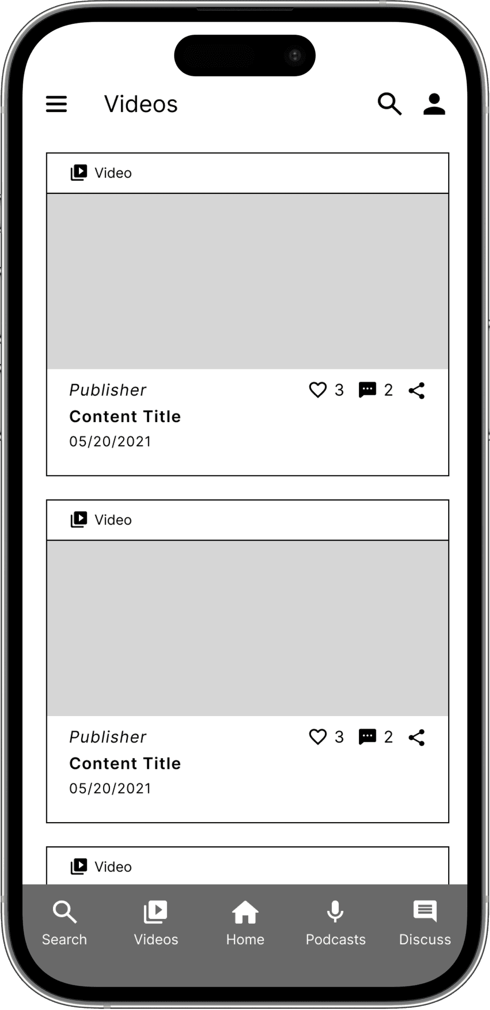
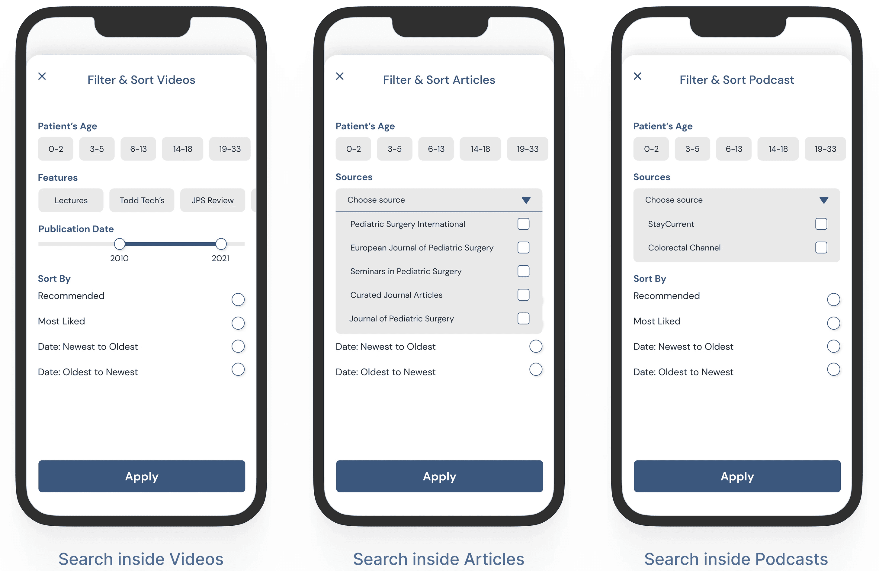
In addition to improving the search capabilities for the global search, I also enhanced the category-based search functions by adding the proper filter options to each category and providing clear labeling. This enhancement ensures that our users, particularly the experienced ones, can enjoy a more efficient search experience. Therefore, we are able to cater to the needs of both experienced and novice users by offering them a seamless and streamlined search experience, regardless of the method they choose.
Proposed Solution #5
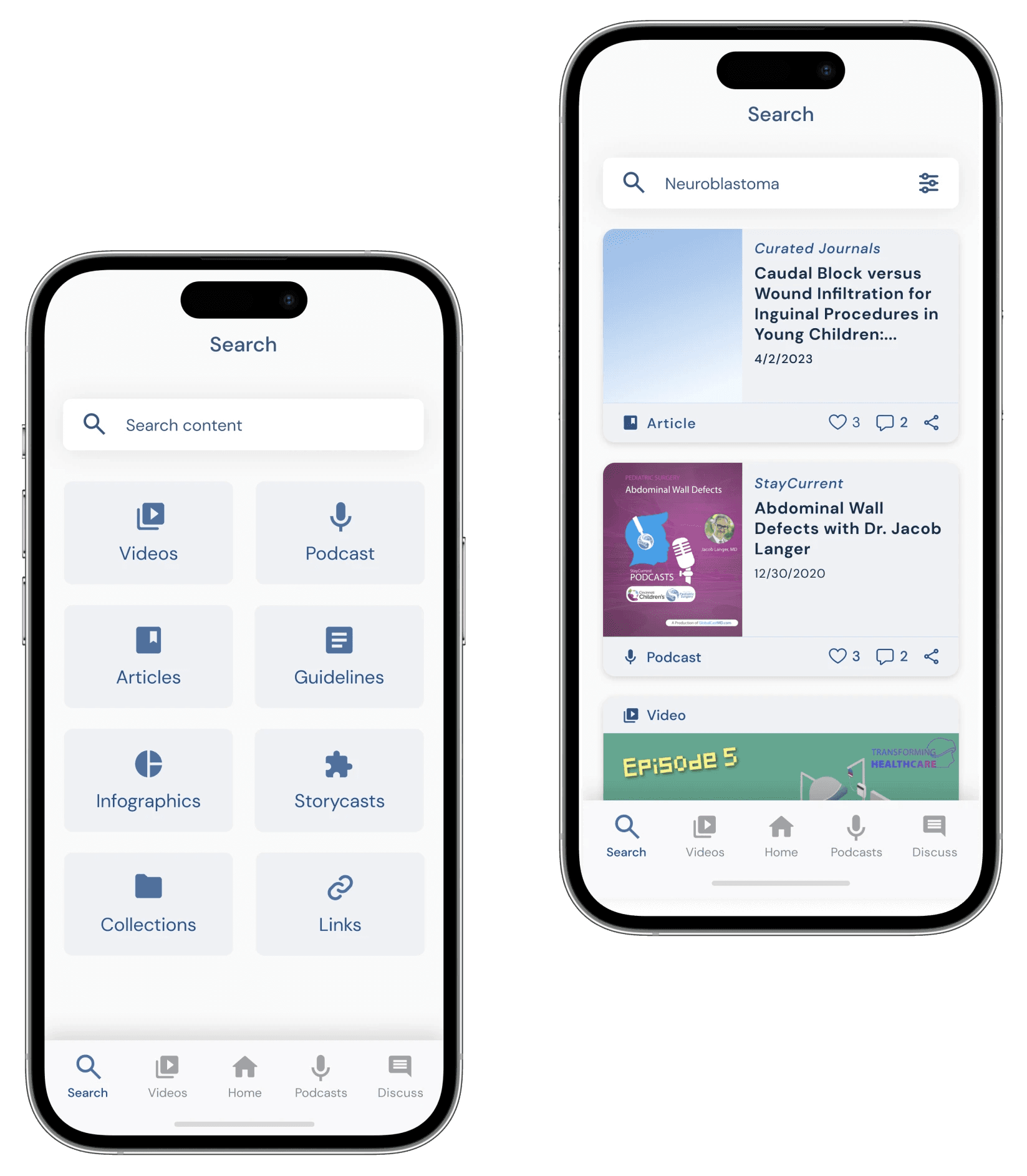
In order to enhance the user experience with the content cards, I implemented several improvements. The most significant changes involved eliminating the content descriptions and increasing the font sizes. By removing the content descriptions, which often lacked clarity and failed to offer users a proper introduction to the content, we were able to free up valuable space. This allowed us to allocate more room for the content titles, preventing them from being cut off. Additionally, we boosted the font sizes to enhance readability. To address the needs of practitioners, we also included the publication date on the content card, as it is deemed crucial in their decision-making process when selecting content.
Prototype
Before finalizing the deliverables, I utilized Figma's prototyping tool to assess my proposed solutions, ensuring that all elements were appropriately linked to their respective screens.
I conducted multiple rounds of testing on the prototype to verify the proper functioning of intended functionalities. This iterative process helped me identify and resolve potential usability concerns.
💻 Click to view the prototype
Outcome
Through this project, I received positive and gratifying feedback and was offered a valuable internship opportunity at GlobalCastMD as a UX/UI Design intern. Collaborating on their app, StayCurrent, gave me practical insights, bridging the gap between theory and real-world practice. I applied the knowledge and skills I had acquired, conducting stakeholder meetings, user research, creating wireframes and prototypes, and implementing iterative design changes. This experience solidified my passion for UX design and equipped me with practical skills for my future career.
If you enjoyed this, consider checking out my other creations!

