Tools
Figma
LucidChart
Zoom
Context
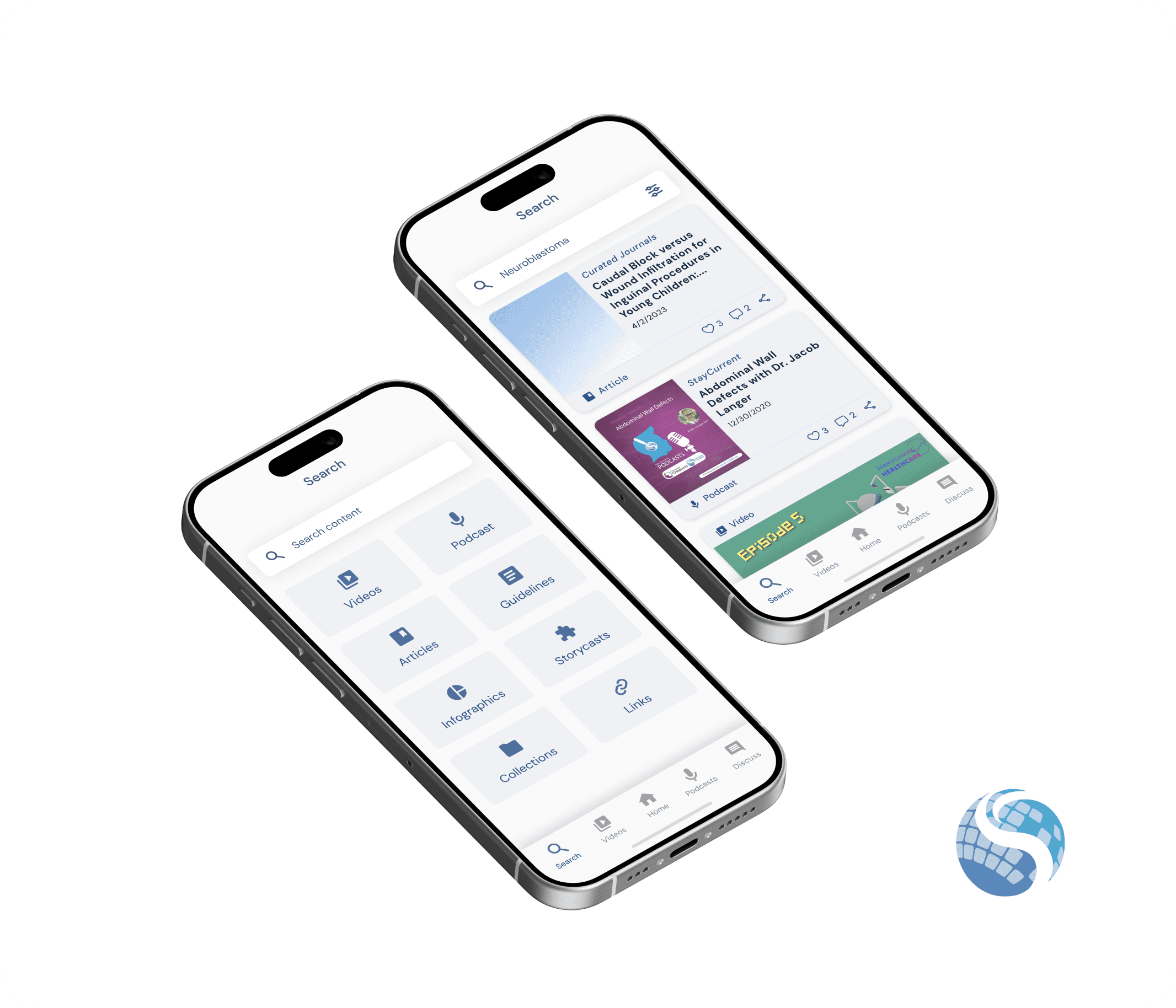
StayCurrent is a medical learning app that helps practitioners at all levels to connect, learn, and share latest medical information. GlobalCastMD (GCMD), the company that owns the StayCurrent app, was looking to add a new feature to the app that would enable their health organization partners to collaborate and share their institution-specific content.
As a UX/UI design intern at GCMD, I was tasked with designing screens for this new feature.
The StayCurrent app features a section called "spaces" where organizations can create private or public channels to showcase their institution-specific content. Among our user groups, health organizations have consistently expressed a high demand for the ability to collaborate with other organizations and gain access to their spaces.
Enhance collaboration and knowledge sharing in the app.
Enable organizations to access content from other organizations they are partnered with.
Design intuitive screens that effectively display the collaboration and content sharing feature.
Result🌟
This feature was launched towards the end of my internship with GCMD, so I do not possess concrete quantitative results. Nevertheless, its primary aim is to assist GCMD in improving user collaboration and content consumption.
Discovery
In our kick-off meeting, we engaged in a discussion about the collaboration and content-sharing feature that customers had requested. Initially, our customers expressed their interest in partnering with only another specific organization and gaining access to its content. However, we recognized the potential for organizations to form partnerships with multiple organizations. As a result, we strategically decided to approach this project by developing a solution that not only addresses their current request but also allows for future flexibility.
Key takeaway:
We want to design a solution that addresses both current and potential future problems
Ideation
We collectively brainstormed various ideas on how to effectively implement this feature. After team deliberations, we concluded that integrating this feature into our space page would be the most logical and optimal approach. Based on this decision, we created a user flow to visualize how users will navigate through the interface.
Design
Since we aimed to launch this feature quickly, I swiftly created mockups of the user flow using our current styling. Currently, the colors used in each space page are aligned with the branding colors of the respective organizations.
I generated several design options for this feature and presented them to the leadership team and our developer during the next project check-in meeting. During the presentation, I explained the rationale behind each design decision.
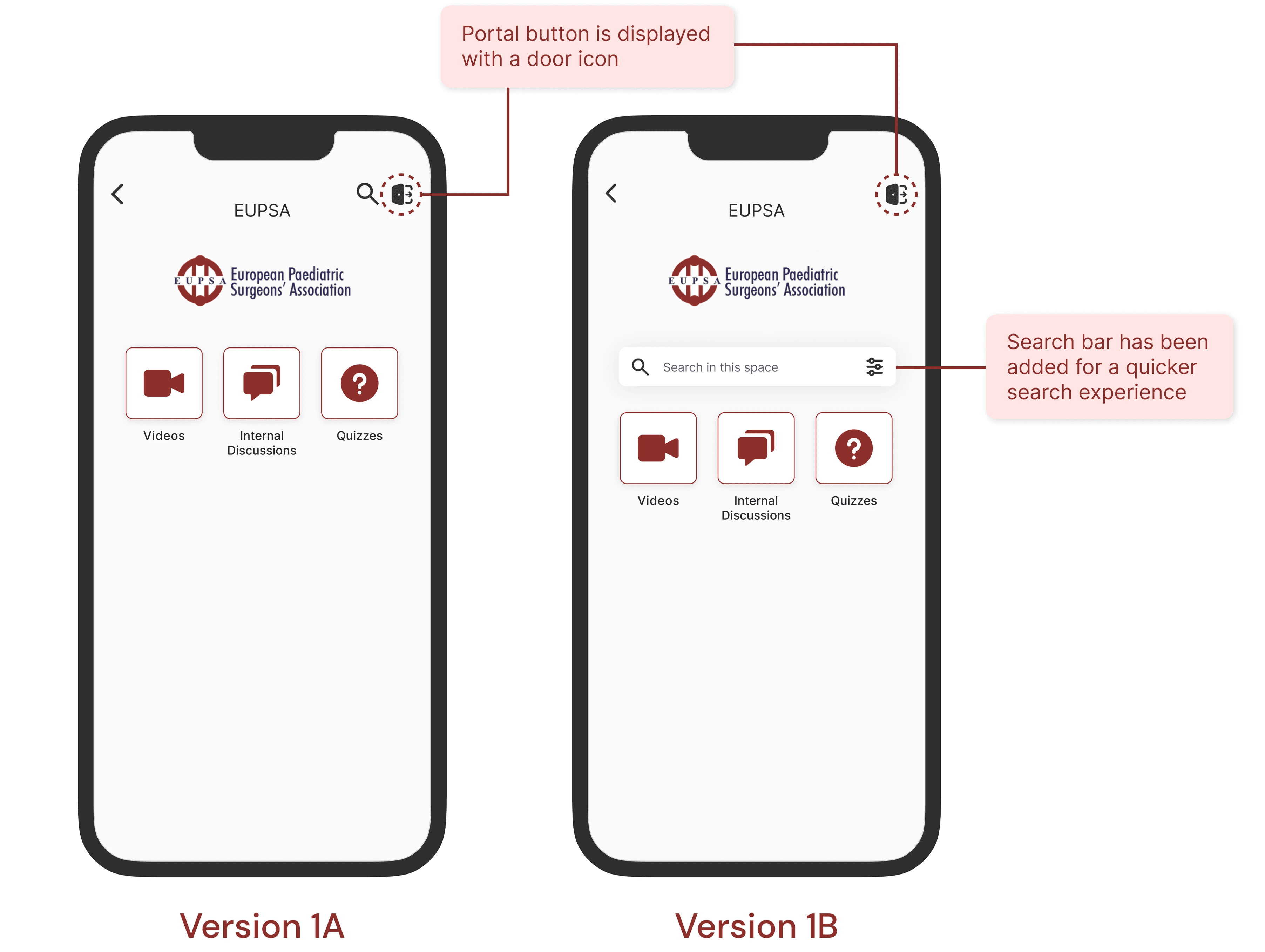
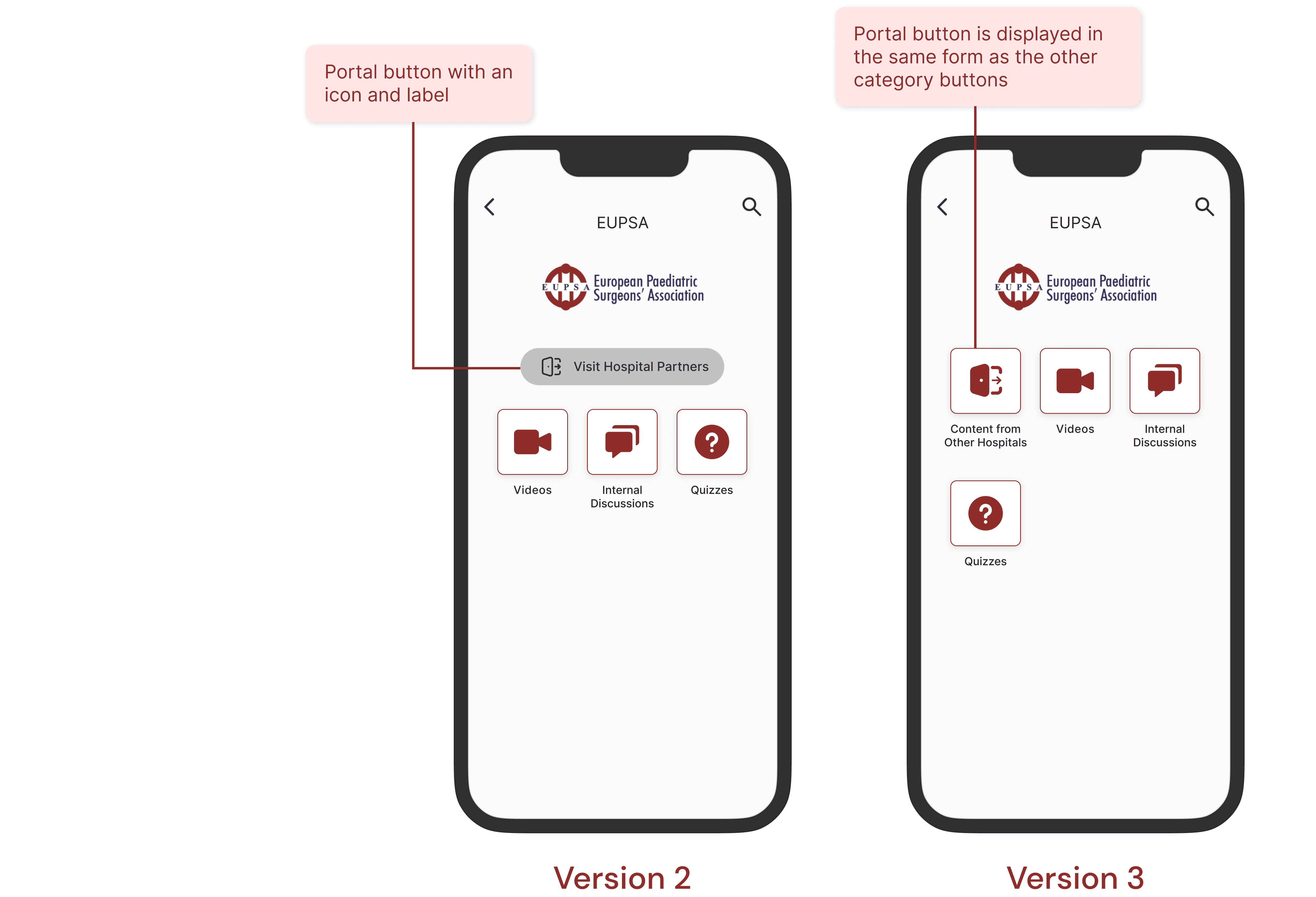
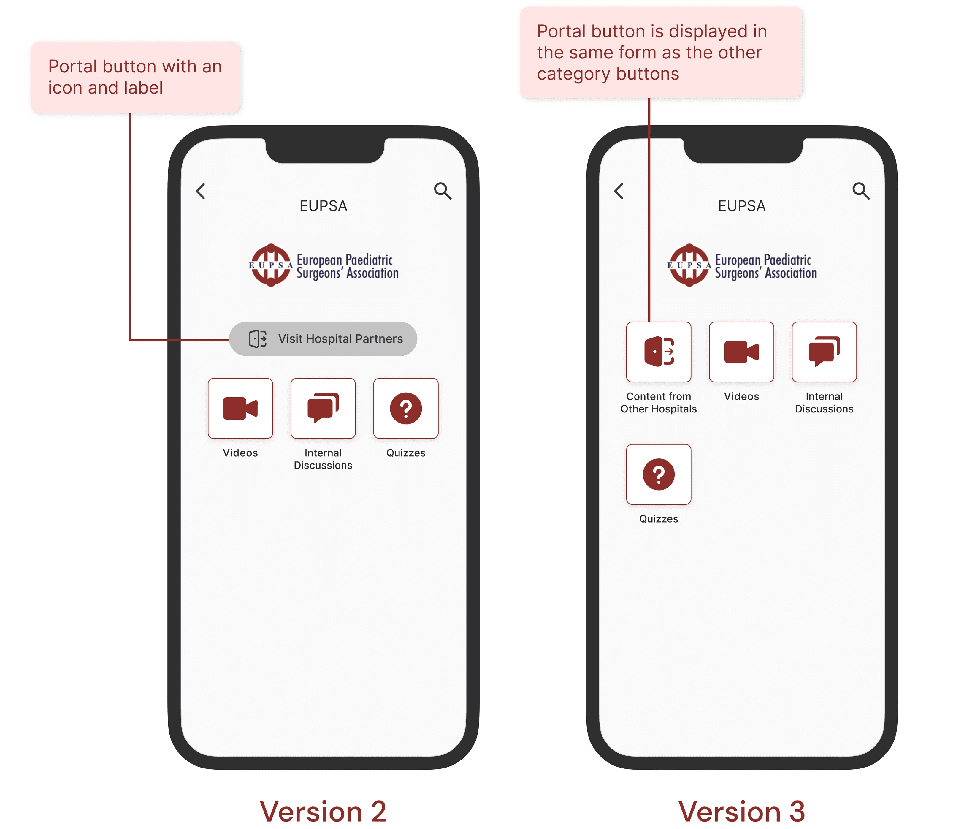
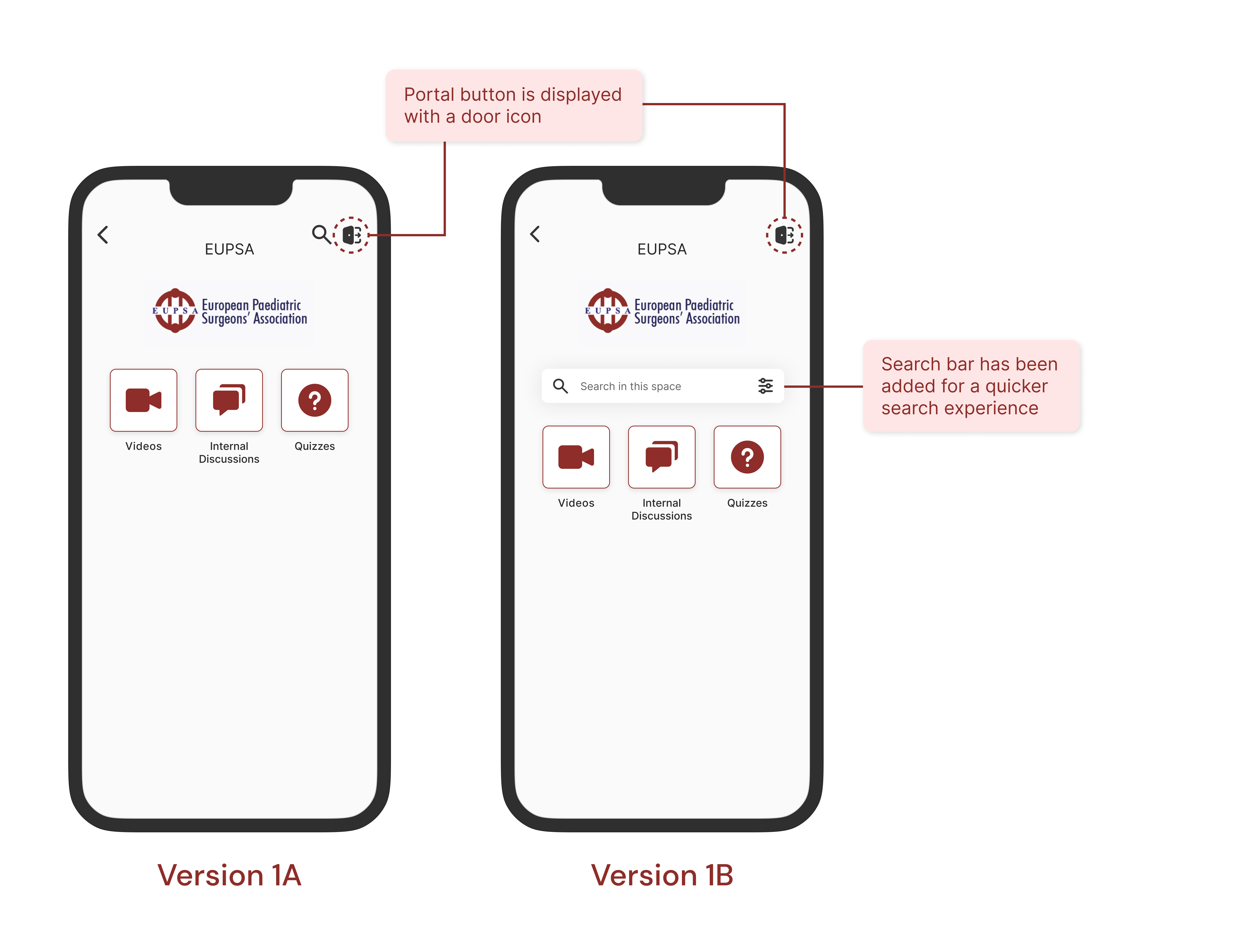
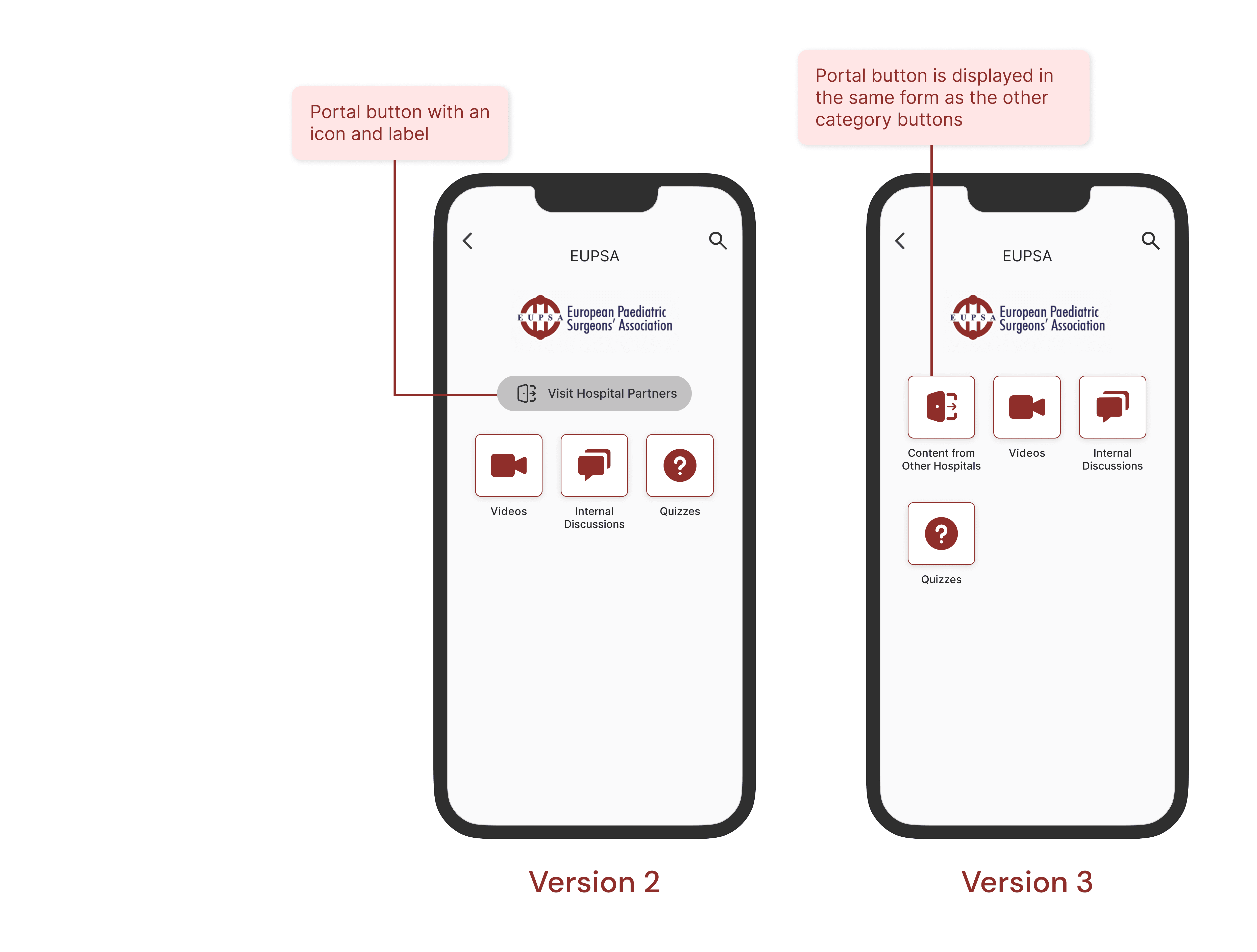
🎨 I designed four different versions for the portal button!
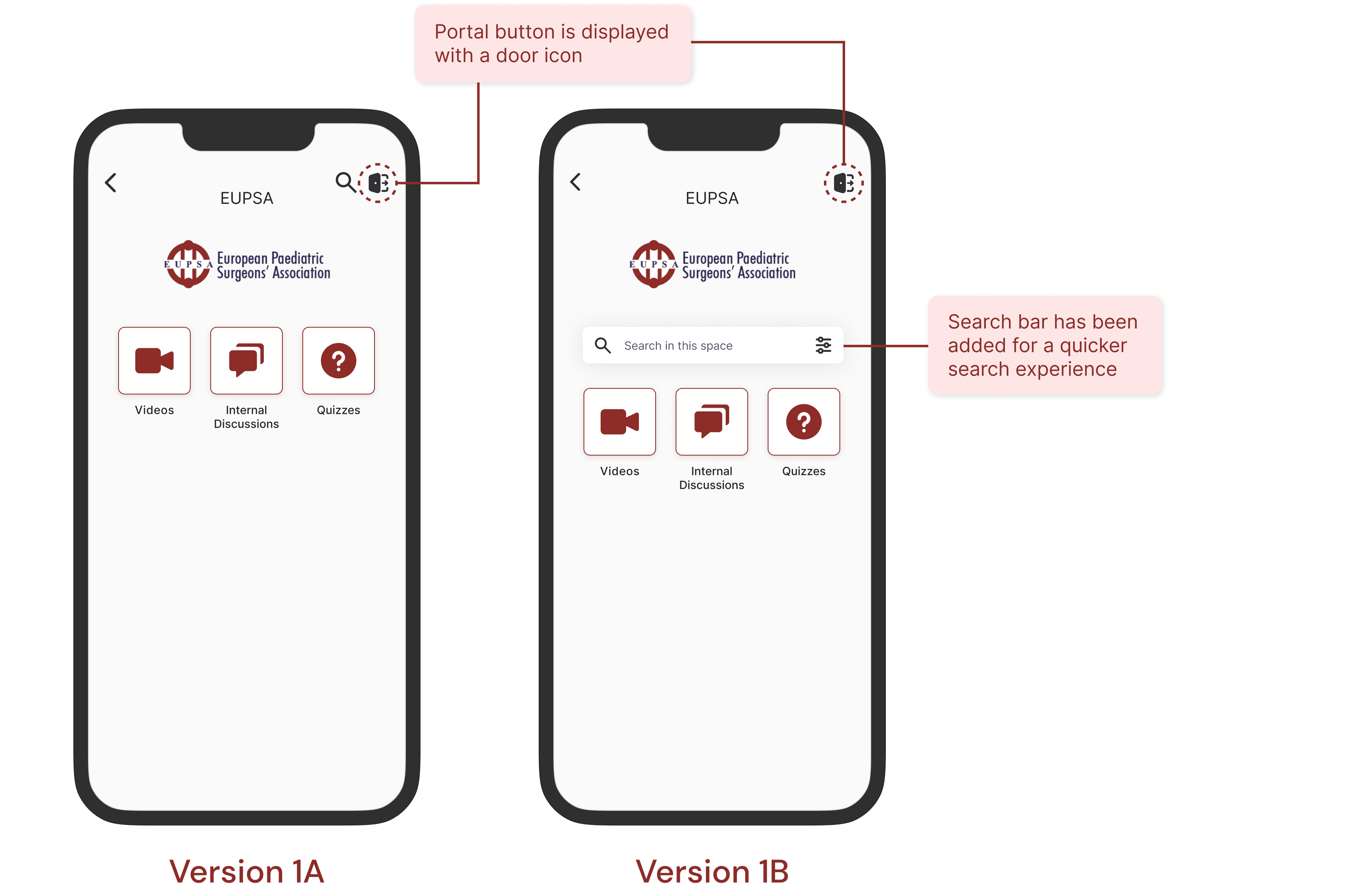
I created several different designs showcasing how the portal button can be displayed for accessing partnering organizations' pages. During the meeting, I discussed the advantages and disadvantages of each version to provide the team with a clearer understanding and aid their decision-making process.
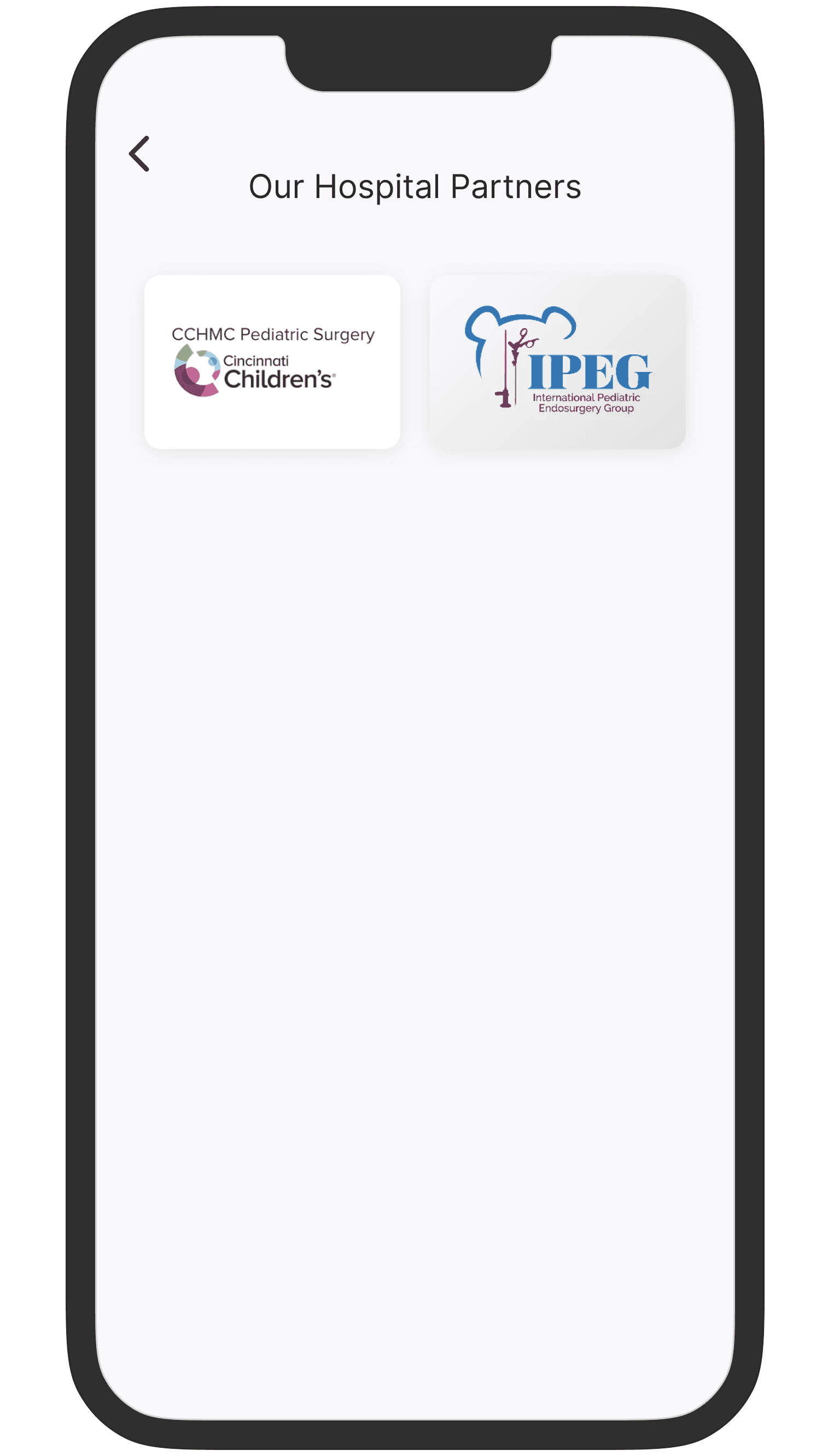
😌 Keeping it simple for the list of partners page
For the partners' list page, I designed a simple and clean layout featuring large-sized buttons that users can click to access the partnering organization's page.
During our meeting, the team was split between Version 1B and Version 3. Some preferred Version 1B for its search bar, while others favored Version 3 because it was the easiest to develop. Here are the key takeaways from our discussion regarding the pros and cons of both versions.
Version 3 is the winner!🏆
Why? because Version 3 maintains the app's uniformity, it's clearly labeled to inform users of its purpose, and it aligns well with our project scope.
👍 Pros of Version 1B
Simple button
Search bar is a nice-to-have
👍 Pros of Version 3
Keeps the uniformity of the app
Will be the quickest to build
There's a label on the button
👎 Cons of Version 1B
Building the search bar will break the uniformity of the page
It will take longer to build the search bar
No labeling
👎 Cons of Version 3
The feature may not stand out since the button uses the same style as the category buttons
Prototype
Before finalizing the project deliverables, I used Figma's prototyping tool to assess my design concepts. I made sure that all elements were properly connected to their respective screens. To ensure everything worked well, I tested the prototype multiple times and addressed any usability concerns that came up during the process.
💻 Click to view the prototype
After receiving feedback from the team during our meetings and going through a few more iterations, several changes were made:
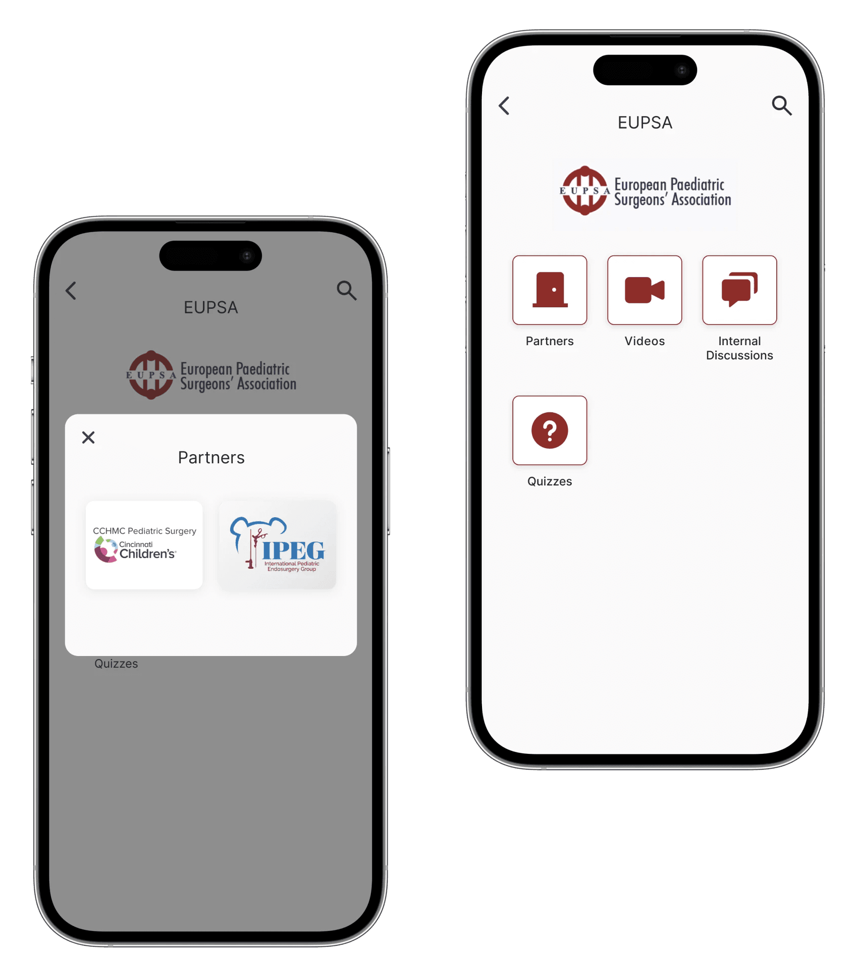
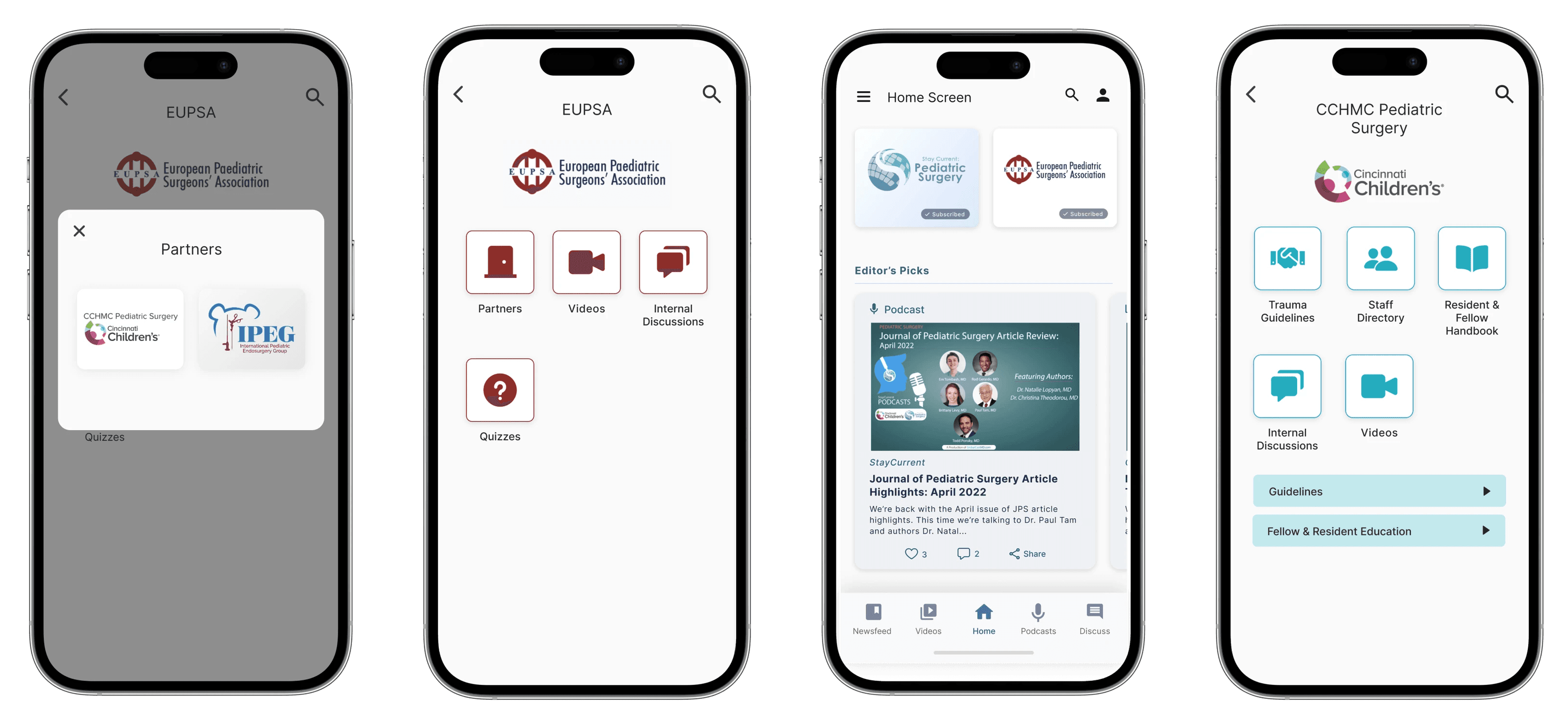
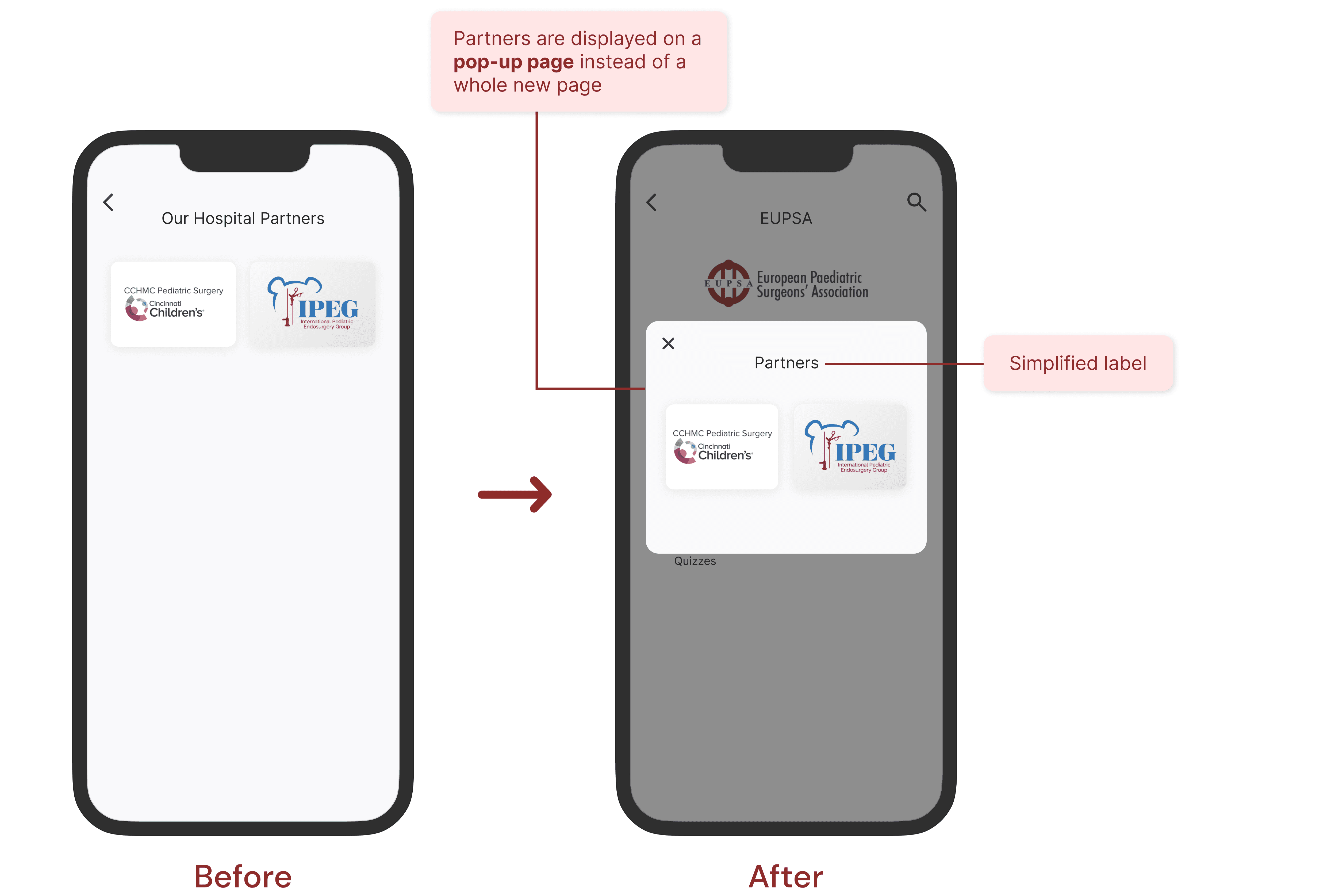
The partners' list page has been converted into a pop-up page instead of being displayed on a separate page. This change was made to expedite the navigation process.
The label "Our Hospital Partners" has been simplified to "Partners."
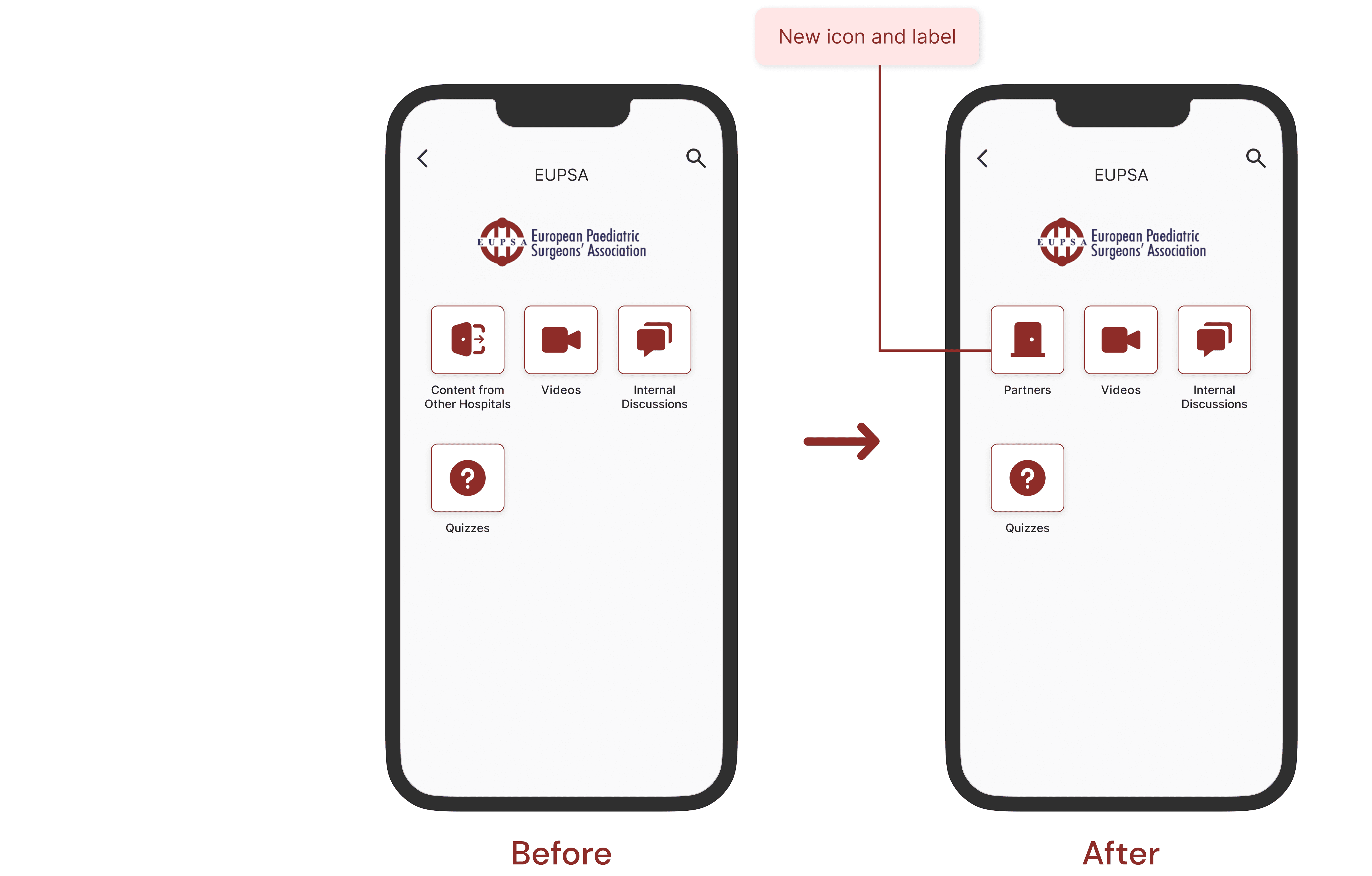
The icon representing the portal button has been changed to a simpler door icon to ensure better consistency with other icons.
The label "Content from Other Hospitals" was too lengthy, so it has been simplified to "Partners."
Reflection
The main lesson I learned from this project is the significance of adapting design communication for different stakeholders. It is crucial to convey ideas in a way that non-technical stakeholders can easily understand. Additionally, I also learned the value of maintaining good communication with developers. By maintaining an effective communication with your developer, you can better understand what is technically feasible and what might pose challenges. This helps in crafting designs that can be effectively implemented.
Overall, this internship project provided me with valuable learning opportunities, and witnessing the transformation of my designs into a functional product was a truly rewarding experience.
If you enjoyed this, consider checking out my other creations!

